Many online transactions (such as registration or checkout) rely on email communication to verify user identity and intent or to establish ongoing customer dialog. So it's no wonder companies and organizations care a lot about valid email addresses in Web forms. Get the wrong email address and potential customers can't be confirmed or contacted.
The most common cause of unintentional email input errors is misspelling. When entering their email address into a Web form input field, people sometimes mistype. They are trying to get through a Web form that is keeping them from their actual goal of joining a community or buying something online. The form is in their way and the sooner they complete it, the sooner they can move on. But when people rush -accidents happen.
To account for this issue (which I've heard shows up in about 2% of successful form completions), many Web form designers or developers simply ask people to input their email address twice. In theory forcing people to retype reduces the number of potential errors and helps ensure an accurate email address is collected. In reality, people don't like repeating themselves and many just cut and paste into the second input field potentially repeating their error in the first input field.

An easy way to reduce the number of input errors caused by mistyping is to increase the size of a form's input fields. This allows people to more clearly see what they have entered and hopefully locate any errors before moving on.

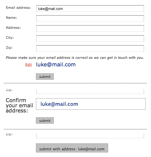
Another possibility is displaying people's input as output elsewhere in the form.
Chris Jackson implemented a solution where after someone enters their email address, a message appears displaying the address they entered and explaining why they should review it: they won’t receive a confirmation if it’s wrong. While the inclusion of an explanation is nice, the sudden appearance of red text after someone enters data into a form is likely to be considered an error by many people.

Russ Unger and Jonathan Knoll implemented five different variations for this approach. They looked at where and how the email confirmation could be displayed: as a button, in an input field, in a read-only state, etc. Check on the full conversation for details behind the design.
