I’ve written extensively about the differences between top, right, and left aligned labels on Web forms. While these considerations account for the majority of form layout options, they don’t cover all the possible ways form labels could be presented on a page. One alternative I get asked about quite regularly is labels within input fields.
In cases where available screen real estate is scant, combining labels and input fields into a single user interface element may be a tempting way to conserve precious space. However, there are a number of considerations worth calling out.
A reliable interaction for labels within forms requires the label to disappear quickly when people place their cursor into the input field so they can easily provide their answer. Otherwise, the label might stay and become part of someone’s answer.
I recently encountered this situation on LinkedIn, a professional networking site. A friend set me an invitation with a personal message stating: “Write a personal note to all the recipients you have selected.” Naturally, that wasn’t how he had wanted to invite me to join his network.
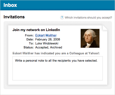
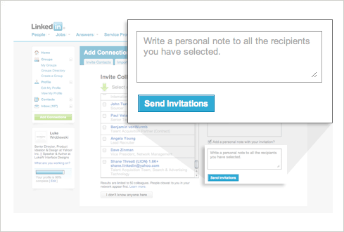
Digging around on LinkedIn, I quickly found the culprit –a label within an input field on the invitation form my friend had filled out. The label had become part of his “personal note”. Clearly, making very sure labels aren’t sticking around in input fields when they shouldn’t be is critical to making labels within input fields work.
Because labels within fields need to go away when people are entering their answer into an input field, the context for the answer is gone. So if you suddenly forget what question you’re answering, tough luck—the label is nowhere to be found. As such, labels within inputs aren’t a good solution for long or even medium-length forms. When you’re done filling in the form, all the labels are gone! That makes it a bit hard to go back and check your answers.
Lastly, labels within input fields should be presented in a way that makes it obvious at first glance that they are labels and not answers. The LinkedIn example rightly grayed out the label text but other options include prefixes or symbols that quickly distinguish labels from answers.
Update:
I got a note from the folks at LinkedIn that indicates this behavior was due to a bug with their script that was introduced by a site redesign. Under normal circumstances, when you click inside the text area, the label is removed. Clicking outside of the text area will return the label value if the text area is empty. For accessibility purposes, LinkedIn uses the actual HTML label for the text area so that if JavaScript is turned off the label will appear above the text area. For the record, I used this example from LinkedIn not to focus attention on their implementation but to point out that even great sites sometimes have problems with labels within input fields!