At some point in their career, every designer has heard the request to make an element "pop more". The premise is simple: to draw attention to a particular element in a layout, make it stand out. However, in practice, the opposite effect often occurs.
Consider the overlaid promotions, tips, or call-outs typically found in an interface. To get these elements noticed, designers will apply contrasting colors, shapes, fonts, and more. All in an attempt to make things pop. But if a pop-up or any element of a user interface for that matter looks too different from the rest of the design, people will often perceive it as something that doesn't belong (like an ad) and dismiss it.
" We see overlay avoidance consistently in the research we conduct with mobile users. Especially when people are task focussed. Then when they do come to use a new function they can't find the help and don't recall seeing the help previously."
-Lisa Duddington Co-founder, Keep It Usable
As Lisa points out, when people are task-focused, they ignore and quickly dismiss overlays assuming they aren’t there to support their core flow but instead to distract from it. Some of these dismissals may even be accidental. That is, people just get rid of dialog-like things by instinct and without thinking.
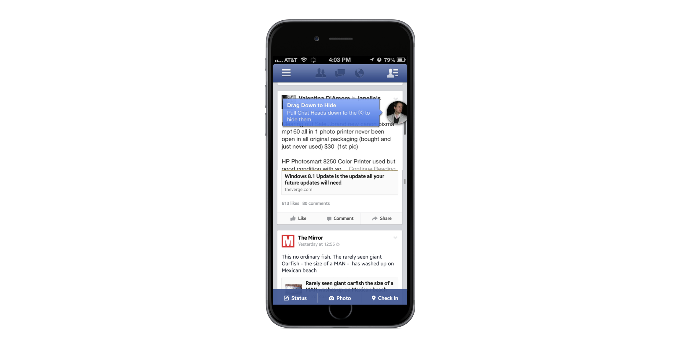
"We saw this all the time at Facebook. People very often, instinctively, dismiss tooltips. On occasion even accidentally. By the time they realize the message may have been helpful, it's already gone and there's no way to recover it."
- Tanner Christensen Product Designer, Facebook
In cases where the overall actually had useful information, when its gone so is the useful information. And there's usually no way to get it back. Probably not the intended effect of making an overlay more noticeable through design.
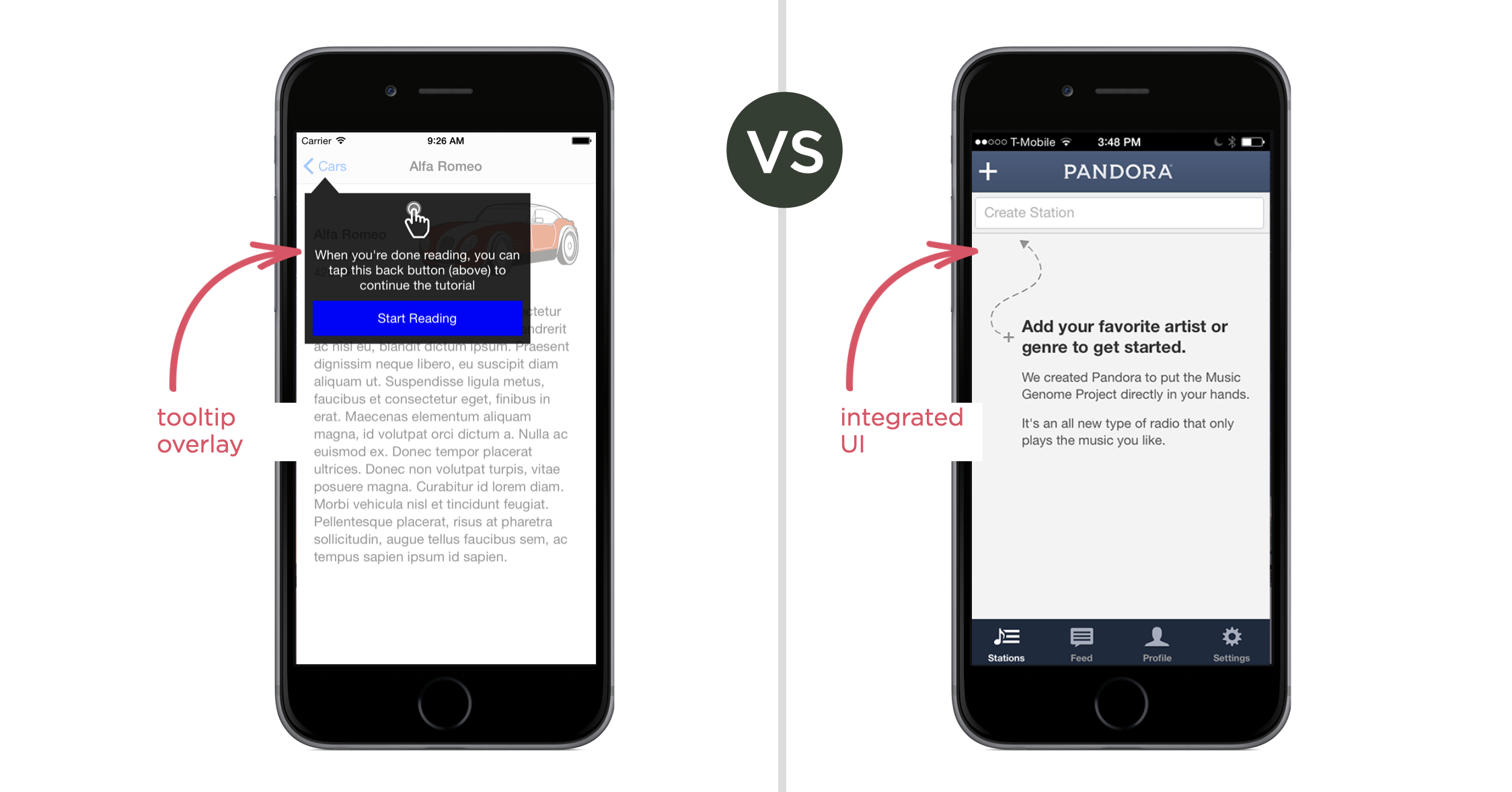
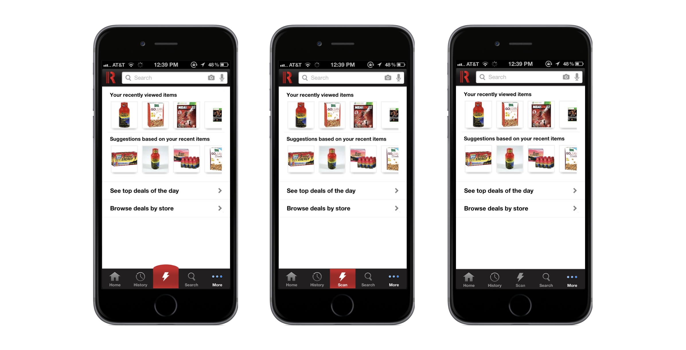
On the other hand, if the pop-up looks like an integrated part of the app or website, it's much more likely to be considered and perceived as relevant. In Red Laser’s case, making the primary action button huge and red led to users completely ignoring it. In subsequent redesigns, they toned down the shape and added a label, making it feel more like part of the core navigation. They even dropped the different color.
"We made our ‘scan’ button huge and a different color from the rest of the nav menu and users entirely ignored it."
-Miles Skorpen, Head of Business Development, Red Laser
As these examples illustrate, instead of making elements visually distinct to be noticed, designers should focus on integrating important elements seamlessly into the user interface. This ensures that crucial actions and information are perceived as part of the overall user experience, rather than distractions to be dismissed.