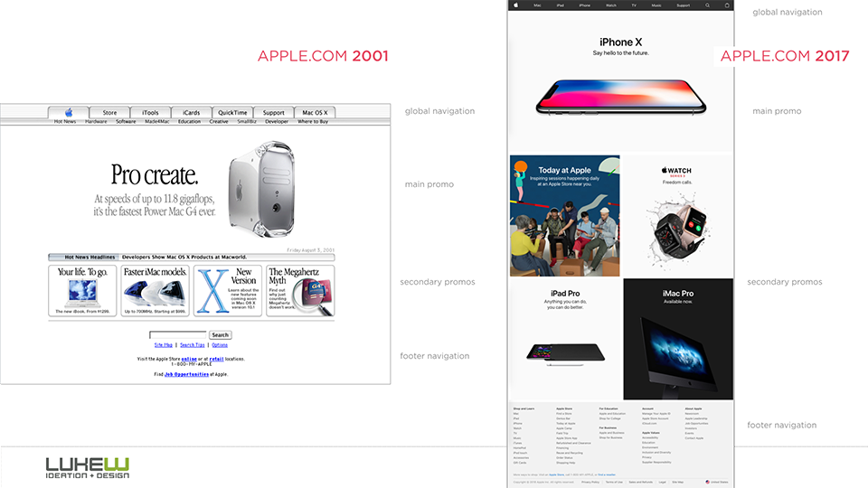
Recently, I dusted off my full day workshop on visual communication for a room full of product managers. While discussing the role of visual hierarchy in screen layouts, I was struck by how many people were impressed at the consistency Apple.com (one of my examples) showed over the years.
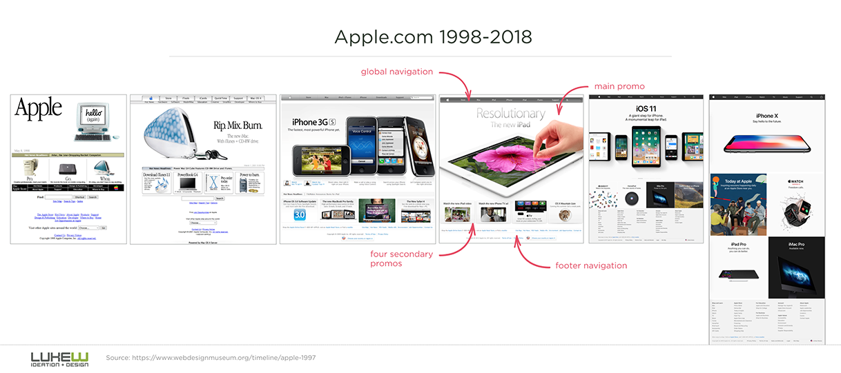
Over the past 17 years, Apple.com's visual style had changed through the application of new fonts, colors, and textures but its underlying layout (or its visual organization) had not.
Looking even further back, Apple.com has retained the same layout structure (primary promotion, 4 secondary promotions, global navigation, and footer navigation) for over twenty years. I guess if your visual hierarchy ain't broke... don't fix it.

