Given the proliferation of bike/scooter sharing services these days, I thought it would be interesting to compare the mobile app on-boarding experiences of the ones I could access. To do so, I went through the new customer flow for six of these services.
While the mobile on-boarding I experienced across these services looked really similar, the end result differed dramatically -from me abandoning the process to walking away a delighted customer. Understanding how product design impacted these outcomes is critical for anyone trying to grow a new mobile business.
Applying Design Patterns
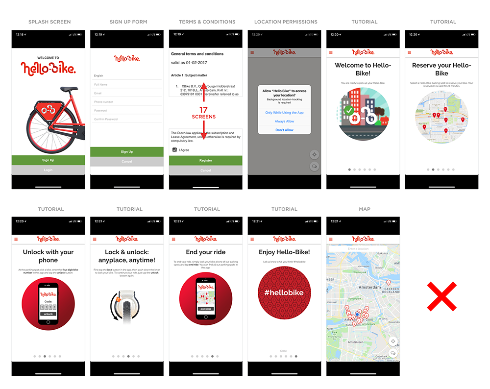
My first encounter with bike sharing, appropriately, was in Amsterdam. I was outside the city center for a meeting and encountered a rack of Hello-Bikes. So why not bike back to my hotel in town? Here’s what happened when I tried.
Hello-Bike’s mobile on-boarding consists of several common patterns: a splash screen, a sign-up form, terms and conditions, and a tutorial. Though widely used, starting the design process off with these types of patterns often results in a flow that seems right in mock-ups or wireframes but fails to solve actual customer needs.
The designer thinks: “I know what an on-boarding flow is. It’s a splash screen, a sign-up screen and a tutorial people can swipe through.” The resulting customer experience in filling in form fields, scrolling through 17 screens of terms & conditions (yes, you are required to scroll through all of them), granting location permissions (because “background location-tracking is required”), and skipping through 6 tutorial screens featuring critical knowledge like “Welcome to Hello-Bike.”
After maneuvering through all this, I found out there were no docking stations in central Amsterdam because of government regulation. So I actually couldn’t use the Hello-Bike service to ride to my hotel. Starting the design process from the perspective of the customer would likely have revealed the importance of communicating these kinds of constraints up front. Starting by selecting design patterns would not.
Lessons Learned:- Set expectations appropriately, so potential customers don’t end a lengthy sign-up process in disappointment or frustration.
- While convenient, design patterns are no substitute for understanding and designing with your customers & their goals top of mind.
Having Desktop Bias
While modern mobile devices have been around for over ten years, desktop devices have had at least 3x more time to influence and bias our approach to software design. That’s why it’s not surprising to see desktop design concepts permeate mobile apps. In the case of Jump’s mobile on-boarding, they are all over the place.
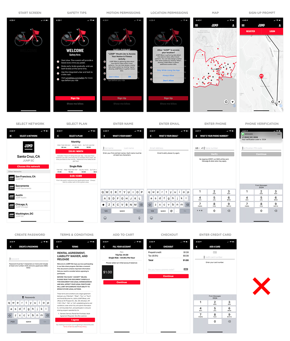
Following the obligatory splash screen, Jump animates through a series of safety tips calling out the unique features of electric bikes. Unfortunately, so many steps follow these tips that I can’t imagine anyone remembering them when they are finally allowed to ride one of Jump’s electric bikes.
Next up are a series of permission dialogs for access to Motion & Fitness and Location data. Both requests are accompanied by explanatory text that suggests Jump needs access to this information in order to “gather data about how electric bikes affect travel patterns.” Sounds like a good thing for Jump, but it’s not clear why customers should participate or even care.
This mindset permeates the rest of Jump’s on-boarding as well: choose one of our bike “networks”, select one of our plans, verify your phone number, pick a 7 character password with numbers and uppercase letters, agree to our terms and conditions, put money into one of our accounts, etc. After ten steps of doing things for Jump and seeing no progress toward actually riding a bike, I abandoned at the “Enter Credit Card” step.
Perhaps someone at Jump heard completion rates for forms go up when you place each question on a separate screen (I’ve seen no evidence of this), but the cumulative effect of going through a desktop-design influenced e-commerce checkout flow one step at a time on my phone was quite painful.
Lessons Learned:- Make sure your customers always feel like they are making progress toward their goals, not yours.
- Desktop paradigms often aren’t a great fit for mobile. For instance, do you really need a checkout form? As we’ll see later, no.
Right Time, Right Place
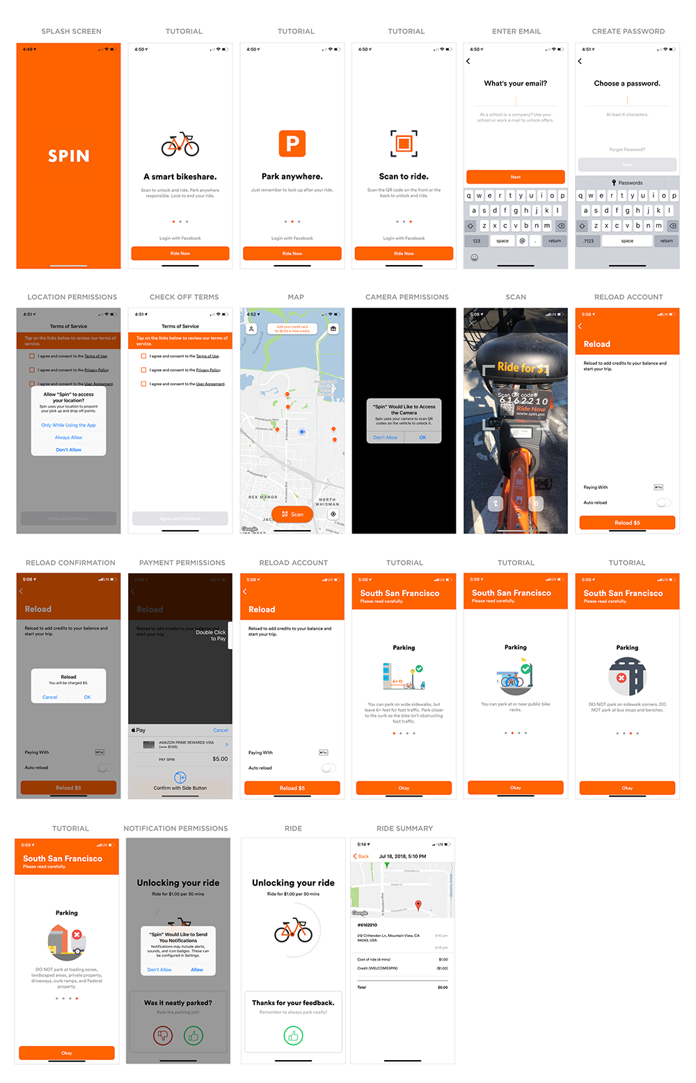
After abandoning the bike-sharing process with both Hello-Bike and Jump, I had my first successful on-boarding with Spin. That’s not to say there wasn’t a lot of room for improvement. With mobile on-boarding it’s not just what we ask people to do it’s also when we ask them to do it. Spin starts off with a tutorial, which explains they are smart, I can park anywhere, and scanning a bike’s QR code will let me ride it.
Turns out that’s not entirely true as I needed to give them my email address, create a password, provide location permissions, and agree to three separate terms of service. It’s only after this gauntlet, that I’m actually able to scan the QR code on the bike in front of me. Why couldn’t we just have started the process there?
It is worth noting, however, that Spin provides much better explanations for its permission requests. When requesting location permissions, Hello-Bike told me: “background-location tracking is required” and Jump explained I could help them “gather data about how electric bikes affect travel patterns.” Spin, on the other hand, explained they use location to help me find pick-up and drop off points. They also explained they needed camera permissions so I can scan the QR code on a bike to unlock it.
After I did, my next step was to reload my Spin account, with the only reloading option being $5. This immediately felt odd as the bike ride itself was advertised as $1. So if I never rode another Spin bike again, they had 4 more dollars from me... hmmmm. On a positive note, Spin integrated with Apple Pay which meant I simply had to tap a button on the side of my phone to approve payment. No checkout forms, shopping carts, or credit card entry forms required. See? We can do things in a mobile-native vs. desktop way.
Following the payment process, I was greeted with a another tutorial (these things sure are popular huh? too bad most people skip through them). This time 4 screens told me about parking requirements. But wait… didn’t the first tutorial tell me I could park anywhere? Next Spin asked to send me notifications with no explanation as to why I should agree. So I didn’t.
Once I rode the bike and got to my destination, I received a ride summary that told me my ride was free. That’s much appreciated but it left me asking again… couldn’t we have started there?
Lessons Learned:- When you surface information to customers is critical. Spin could have told me my ride was free well before asking me to fill my account with a minimum of $5. And their Parking tutorial was probably more appropriate after my ride when parking my bike, not before it.
- Get people to your core value as soon as possible, but not sooner. It took 7 steps before I was able to scan the bike in front of me and 9 more steps before I could actually ride it. Every step that keeps customers from experiencing what makes you great, leaves them wondering why you’re not.
Tricky, Tricky
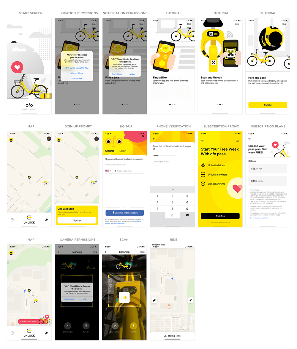
By now, Ofo’s mobile on-boarding process will seem familiar: location and notification permission asks without any useful explanations, an up-front tutorial, a phone number verification flow, a camera permission ask, and more.
For many mobile apps, phone number verification can replace the need for more traditional desktop computer influenced sign-up process that require people to enter their first and last names, email addresses, passwords, and more into a series of form fields. When you’re on a phone, all you need to verify it’s you is your phone number.
With this simplified account creation process, Ofo could have had me on my way with a quick QR code scan. But instead I got a subscription service promotion that suggested I could try the service for free. After tapping the “Try it Free” button, however, I ended up on a Choose your Plan page. It was only when I used the small back arrows (tricky, tricky) that I made it back to the QR code unlock process which let me ride the Ofo bike in front of me with no charge.
Lessons Learned:- Mobile device capabilities allow us to rethink how people can accomplish tasks. For instance, instead of multiple step sign-up forms, a two step phone verification process can establish someone’s account much quicker by using what mobile devices do well.
- While companies have revenue and growth needs, unclear flows and UI entrapments are not the way to build long-term customer loyalty and growth. You may trick some people into subscribing to your service but they won’t like you for it.
But Why?
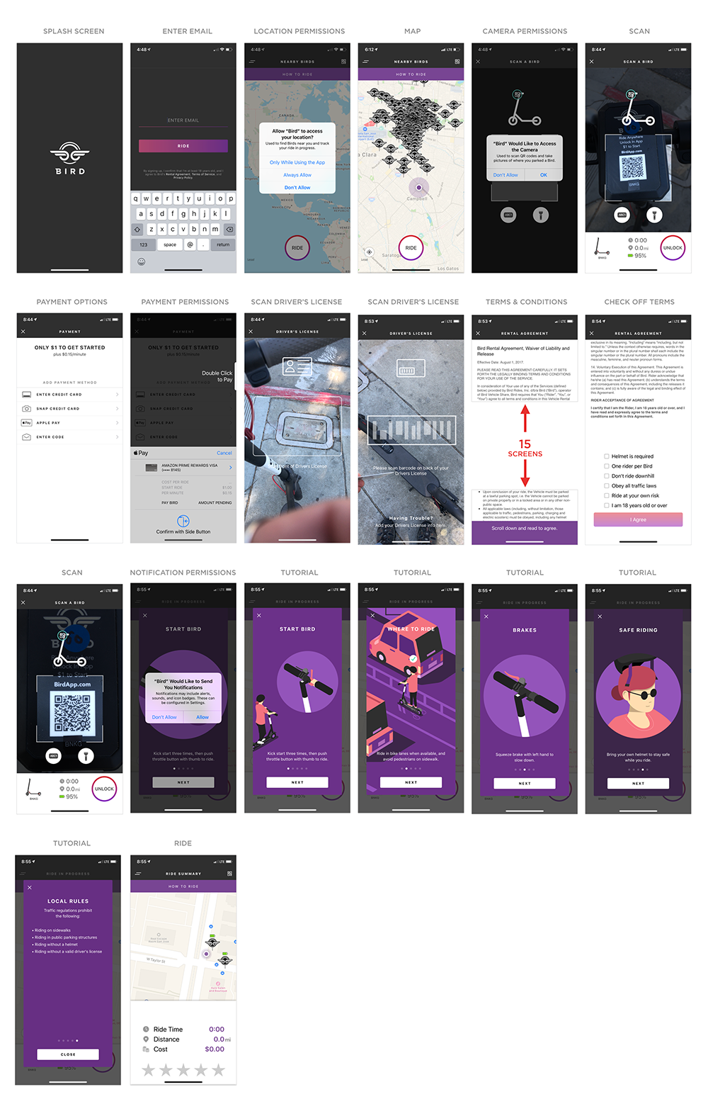
Starting Bird’s mobile on-boarding gave me high hopes that I had finally found a streamlined customer-centric process that delivered on the promise of fast & easy last-mile transportation (or micro-mobility, if you must).
Things started out typically, a splash screen, an email form field, a location permission ask, but then moved right to scanning the QR code of the scooter in front of me and asking me to pay the $1 required to get started. Great, I thought… I’ll be riding in no time as I instantly made it through Apple Pay’s confirmation screen.
As a quick aside, integrating native payment platforms can really accelerate the payment process and increase conversion. Hotel Tonight saw a 26% increase in conversion with Apple Pay and Wish used A/B testing to uncover a 2X conversion increase when they added Apple Pay support. Turns out people do prefer to just look (Face ID) or tap (Touch ID) to pay for things on their phones instead of entering credit card or banking account details into mobile keyboards.
But back to Bird... I scanned the QR code and authorized Apple Pay. Time to ride right? Not quite. Next I was asked to scan the front of my drivers’ license with no explanation of why. Odd, but I assumed it was a legal/safety thing and despite having a lot of privacy reservations got through it. Or so I thought because after this I had to scan the back of my drivers’ license, scroll through all 15 screens of a rental agreement, and tick off 6 checkboxes saying I agreed to wear a helmet, not ride downhill, and was over 18 (can’t they get that from my driver’s license?).
Then it was back to scanning the QR code again, turning down notification permissions, and slogging through a 4 screen tutorial which ended with even more rules. The whole process left me feeling the legal department had taken over control of Bird’s first time customer experience: rental contracts, local rules, driver’s license verifications, etc. -really not in line with the company’s brand message of “enjoy the ride”. I left being intimated by it.
Lessons Learned:- Rules and regulations do exist but mobile on-boarding flows shouldn’t be driven by them. There’s effective ways to balance legal requirements and customer experience. Push hard to find them.
- When asking for personal (especially highly personal) information, explain why. Even just a sentence about why I had to scan my driver’s license would have helped me immensely with Bird’s process.
Core Value, ASAP
By now, we’ve seen how very similar companies can end up with very different mobile on-boarding designs and results. So how can companies balance all the requirements and steps involved in bike-sharing and still deliver a great first-time experience? By always looking at things from the perspective of your customer. Which Lime, while not perfect, does.
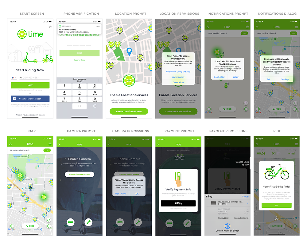
Lime doesn’t bother with a splash screen showing you their logo as a first step. Instead they tell you upfront that they know why you’re here with a large headline stating: “Start Riding Now”. Awesome. That’s what I’ve been trying to do this whole time. On this same screen are two streamlined sign-up options: phone number verification (which makes use of native device capabilities) and Facebook -both aimed at getting you started right away.
Next, Lime takes the time to explain why they are asking for location permissions with the clearest copy we’ve seen in all these examples: “to find nearby bikes and scooters”. Sadly, they don’t apply this same level of clarification to the next permission ask for Notifications. But smartly, they use a double dialog solution and if you say no (which I did), they try again with more clarity.
It’s become almost standard practice to just ask for notification permissions up front in mobile apps because up to 40% of people will just give them to you. So many apps figure, why not ask? Lots of people will say no but we’ll get some people saying yes. Personally, I feel this is an opportunity to improve for Lime.
Ignoring the notifications prompt, the rest of Lime’s on-boarding process is fast and efficient: scan the QR code (once again with a clear explanation of why camera permissions are needed), authorize Apple Pay to pay for your ride. Lime doesn’t either bother to provide other payment options. They know the user experience and conversion benefits of Apple Pay and rely on it exclusively.
And… that’s it. I’m riding. No tutorial! Shocking I know, but they do offer one on the map screen if you’d like to learn more before riding. User choice, not company requirement.
In their mobile on-boarding, Lime deftly navigated a number of significant hurdles: account set-up/verification, location & camera permissions and payment -the minimum amount necessary to ride and nothing more. They did so by explaining how each of these steps got me closer to my goal of riding and worked hard to minimize their requirements, often relying on native mobile functionality to make things as fast and easy as possible.
Lessons Learned:- It’s not about you, it’s about your customer. Put your customer’s goals front and center in your mobile on-boarding process. It starts from the first screen (i.e. “Start Riding Now”)
- Lean into mobile-native solutions: phone verification, integrated payments, and more.
More On On-boarding
For a deeper look into mobile on-boarding design, check out this 20 minute segment of my Mobile design and data presentation at Google Conversions this year:
You can also read Casey Winter’s article about on-boarding, which does a great job outlining the concept of getting people to your company’s core value as fast as possible, but not faster.