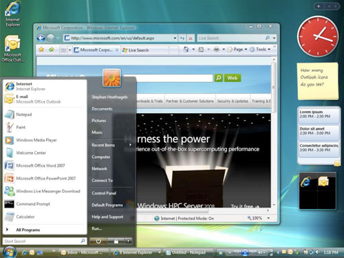
Writing up how the iPhone and Android operating systems handle application access & management differently got me thinking about a presentation on the Windows 7 design process at MIX09. In it, designer Stephan Hoefnagel showed the multiple ways people experience Microsoft Outlook on the Windows Vista desktop:
"There are actually eight icons for Outlook on the Windows Vista desktop and most of them do the same thing. This icon allows you to launch Outlook. This one allows me to switch to Outlook. This icon gives me tell me I have new email and this one gives me status about the Exchange server. [etc.] Now as you can see a complicated app like Outlook is spread out all over my Desktop. Is that what we want?" -Designing the Windows 7 Desktop Experience (video starting at 6 minute mark)

Windows 7 went away from this approach and simplified the presence of applications on the desktop (to the benefit of users). Given that applications on Google's Android operating system can reside in the start menu, as shortcuts, or as widgets of varying sizes across multiple home screens. Perhaps, Android has a similar opportunity to simplify?