A recent lengthy discussion in the Interaction Design Association focused on the placement of actions in Web forms that span several Web pages. The quintessential question underlying this debate is: can an action which leads people to the previous step of a process be placed to the right of an action that leads users to the next step of a process?
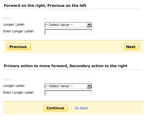
One side of the debate argues that there is a natural organization: actions that move you forward are on the right, actions that move you backward are on the left (in places where people read from left to right). The other side argues that the notion of “primary” actions (those that move people forward) outweigh this consideration and “secondary” actions (which are much less used) can be placed to the right of primary actions even if they allow people to access previous steps. The presence of a prominent primary action in the “line of fire” of people filling a Web form, allows them to land on the action they need to take as they finish answering the questions a form requires. For the sake of clarity, I illustrated this in the image below.

So who is right? Both sides are.
One of the reasons there may be so much debate about this topic is that too often Web designers/developers assume they are making a "wizard" and that people will need to move backwards and forwards through a series of steps. In the vast majority of Web forms, people just want to get through the questions they need to answer and move on. Therefore having a primary action that is "Continue" and a secondary action that is "Go Back" makes a lot of sense. Aligning a prominent primary action with the path to completion (directly below the last question answered) lets people know they can and should move forward. When moving through a linear flow, like e-commerce checkout, the reasons to go back are quite limited and can be covered effectively through final confirmation screens. In fact, a lot of the analytics I have seen show people very rarely utilize "go back" or "previous" controls in these situations.
However, there are instances (though arguably less of them) where forms need to allow people to jump between a set of Web pages in order to accomplish their tasks. In these cases, both Previous and Next could be thought of as primary actions and their placement should match the left to right motion associated with paginating a set of information.
All that said there are situations you certainly want to avoid. I think it’s these options that polarize the conversation about previous and next actions in Web forms.
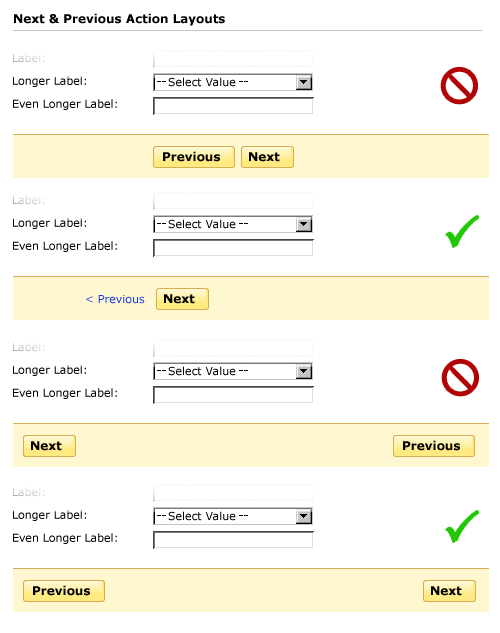
In the image below, the first option should be avoided because people may select “Previous” by default assuming it is the primary action on the form since it aligns directly with their path to completion. Providing a visual distinction between these actions but maintaining the same order (as illustrated in the image) helps prevent this issue. In situations where previous and next are both primary actions, don’t break the left to right order as shown in the two bottom-most examples.

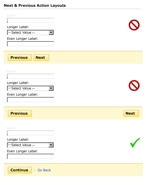
Top-aligned labels are especially prone to challenges of previous and next action positioning because they may lack screen space to the left of the label and input field. In these cases, maintaining a left to right ordering of previous and next actions could lead to inadvertent clicks on “Previous” as people complete the last question on a form. Perhaps the best solution is to think of these actions instead as “Continue” and “Go Back” to help people make forward progress.

In each of these examples a few simple considerations point to appropriate design solutions: ensuring there is a primary action that guides people forward; being careful not to introduce confusion by shifting the left to right order expected when moving between pages; and knowing when previous and next are both truly primary actions so they can be presented as such. As with many design debates, the answer lies not in a strict guideline but in understanding these considerations and acting appropriately.