As a frequent flyer, I regularly find myself jumping onto airport wireless Internet connections between flights. Just about every airport uses a different service provider, but many of them make the same mistakes when designing their sign-up forms.
To understand why, let’s consider the context of an average customer. Their goal is to gain access to the Internet so they can check email, look up information on the Web, or get some work done. Most often, these people don’t have a lot of time because their flight will be leaving soon. This means customers who are already sold on the service (they know they want to get online), and are in a hurry.
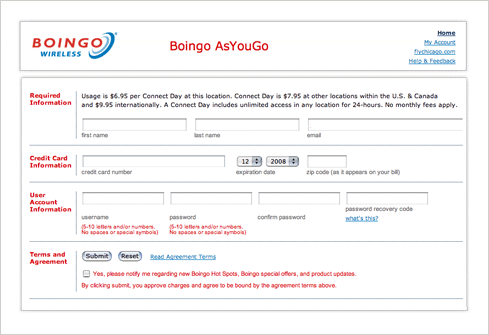
Any Web form being used in this context should strive to minimize the amount of time it takes to complete and work to be as error-free as possible. Boingo, pictured below, unfortunately gets this wrong by insisting all potential customers create a user account before getting online. The inclusion of this step causes unnecessary questions: do I have to create an account? If so, why do I need one? Maybe I already have an account? Boingo doesn’t answer any of these questions.

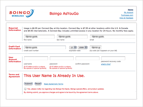
To make matters worse, the form provides no validation for username or password inputs. This leaves people in a pogo-sticking mode of guessing a username that might be available, submitting the form, finding out their selection is taken and repeating the process all over again. To top it off, the error indication the form uses mirrors the rest of the input labels (bold red Verdana text) and its positioning above the terms of service requires a double take before being noticed.

It’s hard not to imagine this Web form design costing Boingo money. Travelers in a hurry to jump online aren’t interested in repetitive form submissions that require them to guess an appropriate username for an account they don’t want in the first place. It’s likely several of them bail out of the process. Why any company would make it hard for customers to give them money –I don’t know.
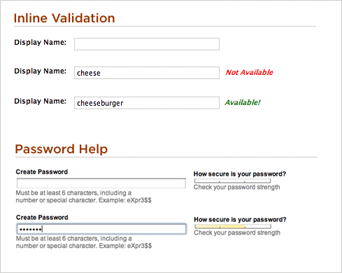
If Boingo, was interested in additional income, this particular form could be substantially improved by removing the user account information fields. If the company wants to give people the option of creating an account for easier access next time, they can do so with a prompt after giving people access to the Internet. If there is a legal or technical requirement for mandatory user accounts (which seems quite unlikely), inline validation can help people select proper usernames and passwords (as seen below) and better error messaging (a topic explored in depth in Web Form Design Best Practices) can resolve issues faster.

That said few things improve form completion rates and times like getting rid of unnecessary inputs and in most forms, there’s ample opportunity to trim.