Seems like every app these days, including this Web site, has a chat interface. While giving powerful AI models an open-ended UI supports an enormous amount of use cases, these interfaces also come with issues. So here's some design approaches to address one of the most prominent ones.
First of all, I'm not against open-ended interfaces. While these kinds of UIs face the typical "blank slate" problem of what can or should I do here? They are an extremely flexible way to allow people to declare their intent (if they have one).
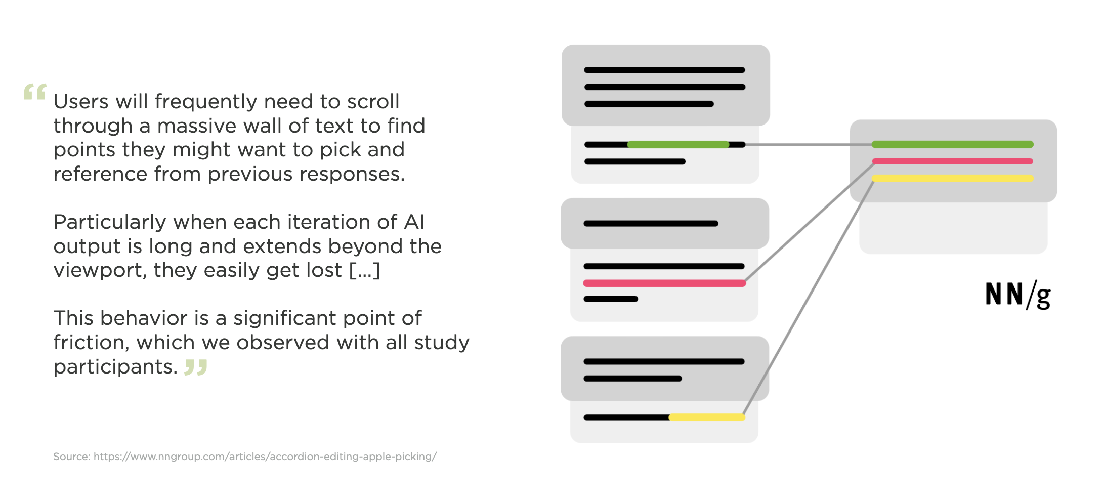
So what's the problem? In their article on Early Generative-AI User Behaviors, the Nielsen/Norman Group highlighted several usability issues in AI-chatbot interfaces. At the root of most was the observation that "people get lost when scrolling" streams of replies. Especially when AI models deliver lengthy outputs (as many are prone to do).
To account for these issues in the Ask LukeW feature on this site, where people ask relatively short questions and get long-form detailed answers, I made use of an expand and collapse pattern. You can see the difference between this approach and a more common chat UI pattern below.
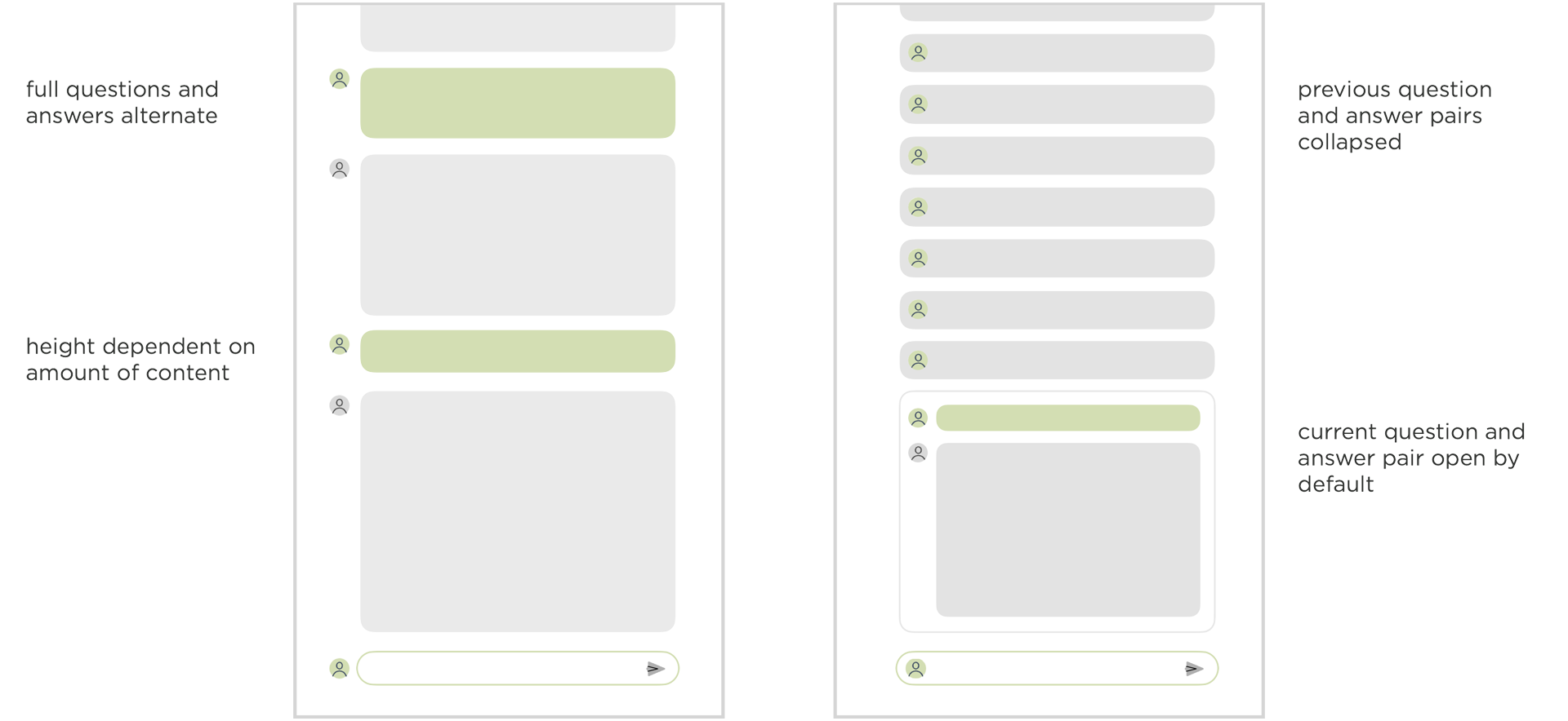
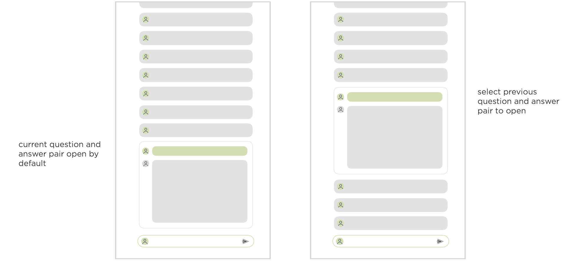
Here's how this pattern looks in the Ask LukeW interface. The previous question and answer pairs are collapsed and therefore the same size, making it easier to focus on the content within and pick out relevant messages from the list when needed.
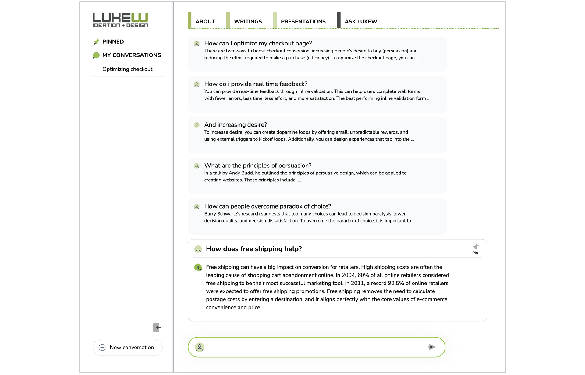
If you want to expand the content of an earlier question and answer pair, just tap on it to see its contents and the other messages collapse automatically.
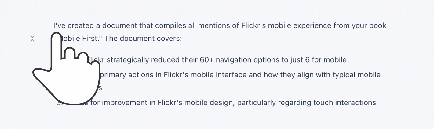
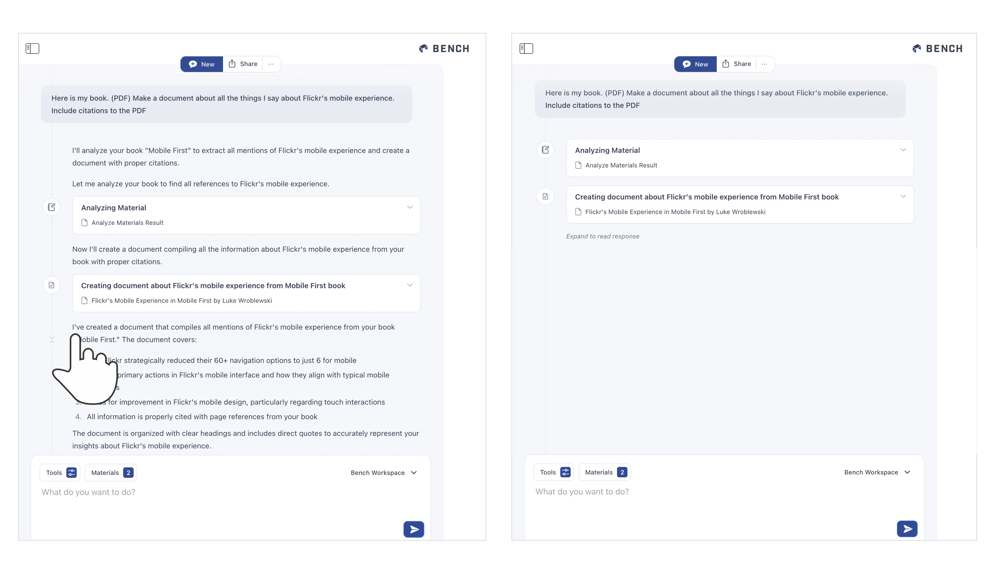
We took this a step further in the interface for Bench, an AI-powered workspace for knowledge work. Unlike Ask LukeW, Bench has many tools it can use to help people get work done (search, data science, fact check, remember, etc.).
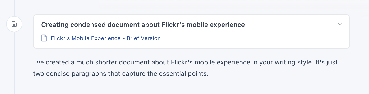
Each of these tools can create a lot of output. When they do, we place the results of each tool in a separate interface panel on the right. This panel is also editable so people can refine a tool's output manually when they just want to modify things a little bit.
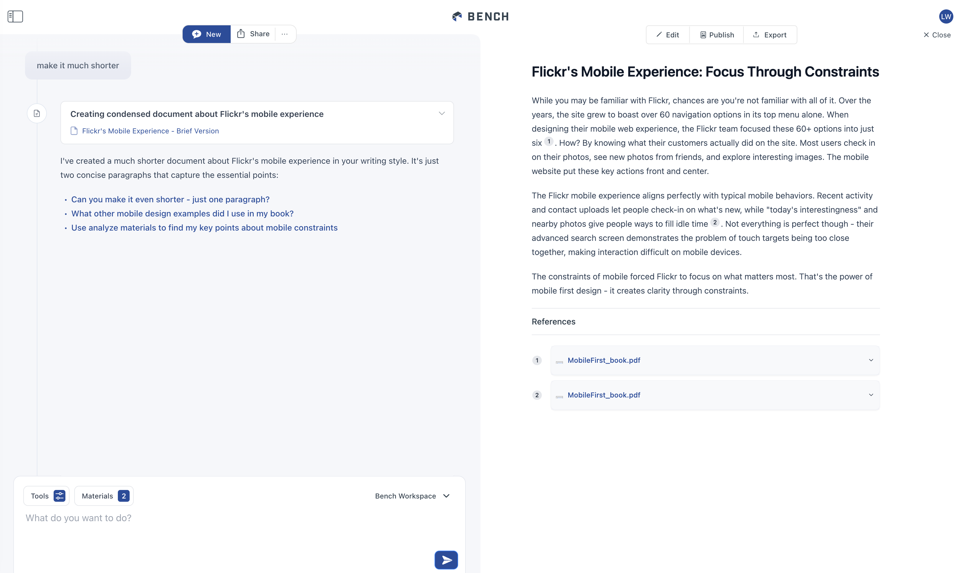
When the next tool creates output or people start another task, that output shows up on the right. The tool that created the output, however, remains in the timeline on the left with link to what it produced. So you can quickly navigate to and open outputs.
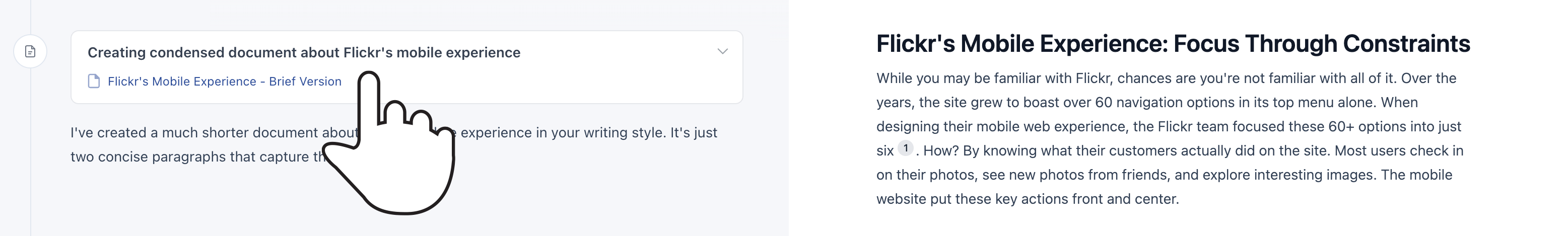
But what happens when there's multiple outputs... don't we end up with the same problem of a long scrolling list to find what you need? To account for this, we (thanks Amelia) added a collapse timeline feature in Bench. Hovering over any reply reveals a little "condense this" icon on the timeline.
Selecting this icon will collapse the timeline down to just a list of tools with links to their output. This allows you to easily find what was produced for you in Bench and get back to it.
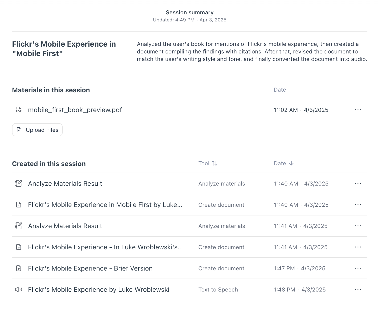
OK but even if the timeline is collapsed, people still have to scroll the timeline to find the things they need right? So they're still scrolling just less? For this reason, we also added a home page for each session in Bench.
If you close any output in the pane on the right, you see a title and summary of your session, all the files you used in it, and a list of all the outputs created in the session. This list can be sorted by the time the output was produced or by the tool that made the output. Selecting an output in this list opens it up. Selecting the tool that created it takes you to the point in the timeline where it was produced.
While I tried to illustrate this behavior with images, it's probably better experienced than read. So if you'd like to check out these interface solutions in Bench, here's an invite to the private preview.