Though most people wouldn't consider Apple's Web site an important online destination, November saw Apple in the top ten list of US Web sites. 62 million Internet users visited Apple online during the month with an average of 1 hour and 18 minutes spent per user. By comparison, Google had 155 million unique visitors in November.
Apple's online store certainly played a role in this achievement as retail sales data shows that Mac sales were up 21% year-over-year in the months of October and November. So it's interesting to note that Apple's primary online sales channel (Web-based checkout) was redesigned during this time.
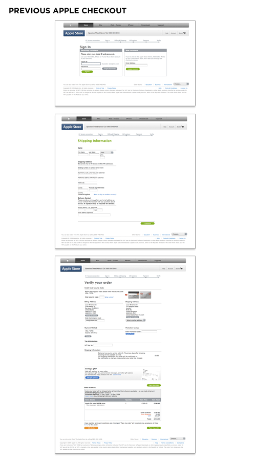
The previous design of Apple's checkout form spanned multiple pages and utilized a top-level progress indicator to highlight where people were in the proces. Errors were displayed at the page-level and did not reference the fields responsible for errors nor provide actionable remedies when error messages showed up. The final checkout confirmation screen had a confusing mix of buttons instead of a single primary call to action.
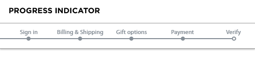
While it’s certainly a good idea to let people know how far along in a process they are, you need to be wary of progress indicators that incorrectly represent the number of Web pages or steps required to complete a form. An all too common practice for forms spanning multiple Web pages is the inclusion of a progress indicator that does not accurately mirror the number of pages a form requires.
Consider a typical ecommerce checkout form progress indicator that states there are three pages of inputs you can expect: shipping, billing, and place order. When it comes time to select a shipping address, however, page one is selecting from an existing list of shipping addresses. If the address you want to ship to is not listed, an additional page is required, and you need to add a new address. All of a sudden, step one becomes two steps. When selecting billing in step two, you may need to verify an online payment service provider, log in to its site, select a source of funding, or provide a new billing address. Now step two is four steps.
So we’ve taken six steps to accomplish what we told our customers was going to take two steps. It’s not that giving people a sense of how many steps are required is a bad thing; but we are rarely telling them the truth. One solution is to avoid the progress indicator altogether and just get people through the form as fast as possible. The other is to provide a more high-level progress indicator that does not set expectations explicitly.
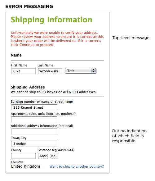
The input field that is responsible for an error should not only be visible on the page but also prominently marked. Both the top-level error message and this input field need to have clear instructions that encourage people to either try another answer or seek help if they can’t. The inclusion of instructions next to the input field responsible for the error provides people with a remedy where they need it most: where the error can be fixed.
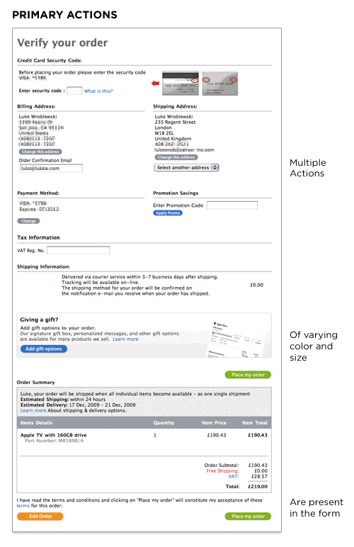
Actions such as Submit, Save, or Continue are intended to enable completion, which is the primary goal of just about anyone who has started filling in a form. Because they enable the most important action on the form (completion), they can be referred to as primary actions. Secondary actions, on the other hand, tend to be less utilized and often allow people to retract the data they’ve entered. Because secondary actions can have negative consequences, especially when used unintentionally, I’ve often argued they should be absent from forms.
That said, there are situations where secondary actions make sense (such as Save for Later, Preview, Export, etc.). Though it may be tempting to treat Previous and Next as equal actions in these circumstances, keeping people moving forward with a primary Continue action and a secondary Back action is likely to be more productive. After all, we want people to complete these forms, right? When you reduce the visual prominence of secondary actions, it minimizes the risk for potential errors and further directs people toward a successful outcome.
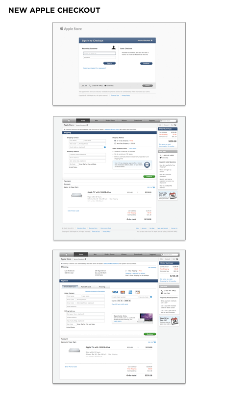
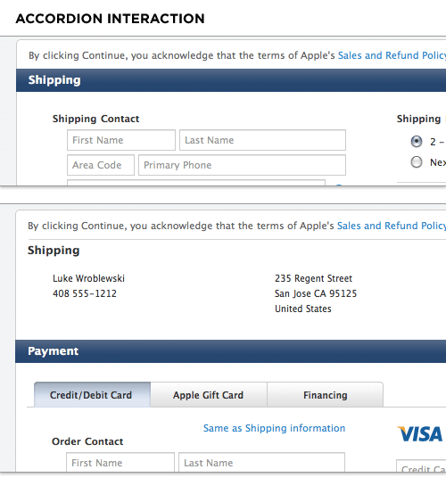
Apple's redesigned checkout form utilizes an accordion interaction to move people through sets of related questions. This eliminates the need for multiple Web pages and the progress indicator in the previous design. As people complete each section, the form expands inline to display the next set of required questions. You can see this in action on the Apple store.
While the previous form design used top-aligned labels to present questions to users, the new design utilizes top-aligned labels for section headers only and labels within input fields for everything else. In cases where available screen real estate is scant (like an accordion form), combining labels and input fields into a single user interface element may be a tempting way to conserve precious space. However, there are a number of considerations worth calling out.
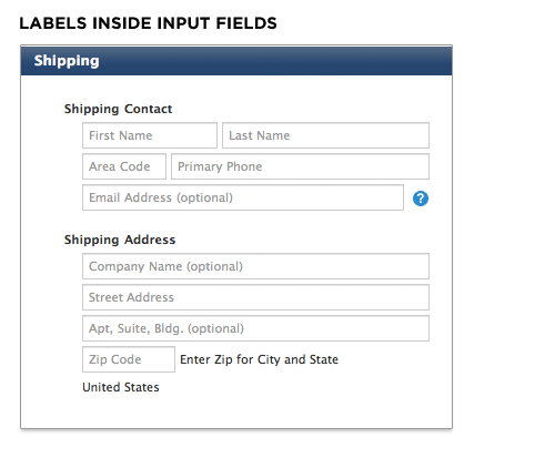
A reliable interaction for labels within forms requires the label to disappear quickly when people place their cursor into the input field so they can easily provide their answer. Otherwise, the label might stay and become part of someone’s answer.
Because labels within fields need to go away when people are entering their answer into an input field, the context for the answer is gone. So if you suddenly forget what question you’re answering, tough luck—the label is nowhere to be found. As such, labels within inputs aren’t a good solution for long or even medium-length forms. When you’re done filling in the form, all the labels are gone! That makes it a bit hard to go back and check your answers.
Apple's solution may be able to mitigate this issue because the form is mostly asking for inputs with a known structure. Mailing addresses, for example, have a widely known structure that can be leveraged to help people understand how to answer questions about shipping or billing locations. Other examples include first name and last name, date and time, or the parts of a phone number. These input groups can be utilized within forms to provide additional clues on which questions were answered (once the labels are gone). The always visible section headers help as well.
Lastly, labels within input fields should be presented in a way that makes it obvious at first glance that they are labels and not answers. The Apple form grays out the label text to distinguish labels from answers.
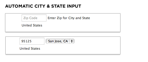
On the new Apple checkout form, people are asked for their ZIP code first and then given a set of choices for their city and state. On the plus side, this interaction design removes some awkward ways of answering questions. Specifically: drop-down menus for states that run 50 entries high. On the negative side, when faced with a set of inputs that match the structure of a mailing address (as mentioned above), people often skip over labels as they fill in the pieces. The components and layout of an address are familiar to just about everyone in the US. The Apple site breaks this structure by asking for ZIP code out of order.
Any question you ask people in a Web form requires them to parse it, formulate a response, and then input their answer in the affordance you have provided on the form. Being vigilant about every question you ask allows you to remove questions that are not absolutely necessary, or can be asked at a better time or place, or can be inferred automatically. And the fewer questions you ask, the better the odds are of people completing your forms quickly and easily.
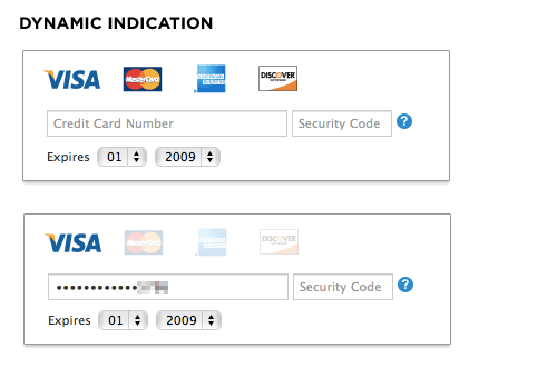
Credit card numbers follow a consistent structure. American Express cards start with either 34 or 37. Mastercard numbers begin with 51–55. Visa cards start with 4. And so on. This information can be used to infer what type of credit card someone is using simply by looking at his credit card number.
In their redesigned checkout form, Apple does exactly that. When someone enters a credit card number, the appropriate card type is highlighted directly above. This eliminates the need to ask people what type of credit card they have—one less question to parse, think through, and respond to.
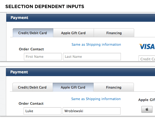
Selection dependent inputs require people to answer follow-up questions based on their answer to an initial question—usually without having to go to another Web page. The new Apple checkout form's payment section uses selection dependent inputs to ask follow-up questions based on the payment method people select. Horizontal tabs arranged across the top of the Payment section allow people to navigate to a section of the form that contains appropriate selection-dependent inputs. The tabs present not only the initial set of options, but also provide a strong indicator of the current selection.
While most people are familiar with the concept of navigation tabs on the Web, the way in which they fill in Web forms may impair the effectiveness of this approach. When completing a form, many people move from top to bottom and, as a result, may ignore horizontal options. There may also be a lack of clarity about whether horizontal tabs are mutually exclusive. Will I submit my selections on all three tabs with the form or only the selections I made on the active tab?
However, when testing horizontal tabs in Web forms for my book Web Form Design, none of our participants made any errors, they were able to complete the task quite quickly, and provided high satisfaction scores for this design. So Apple seems to have picked the best fitting UI for this task from the options available.
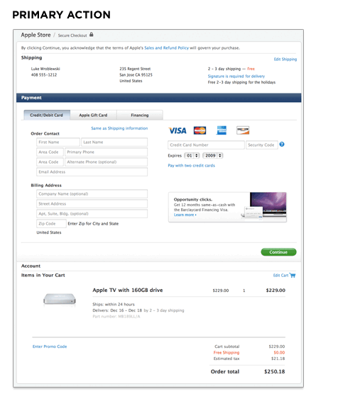
As we saw, Apple's previous checkout form had a number of visual calls to action of varying shapes and colors. The new design significantly reduces the visual weight of secondary actions and puts all the focus on one primary action: Continue. This helps to illuminate a clear path to completion in the form.
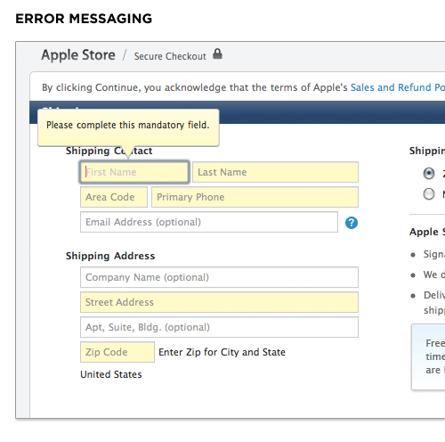
Apple's new checkout form also introduced in-context error messages. So errors are now displayed next to the input fields causing them with clear instructions on how they can be resolved.
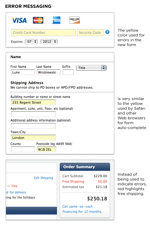
However, the elimination of a top-level error message means it is possible to enter a state where errors are present on a page but only indicated through a light yellow background color. I had this issue come up when changing my credit card information. The credit card number and security code were in an error state but nothing on the form (beyond the light yellow color) told me that. This is especially troubling when you consider that Apple's Web browser, Safari, and other browsers use a similar shade of yellow to indicate input fields they autofill for you.
In fact, in Apple's previous checkout form a light yellow background indicated an auto-completed input field. In the new checkout form, it indicates an error. Why isn't Apple using red (the standard color for errors) in its form? That seems to be reserved for free shipping!