The most valuable contribution product designers can make to software is making the core value of a product clear to the people using it. Yet over and over again... this seemingly simple objective doesn’t get met. Why?
Making the value of a product clear through use (esp. first time use) is how to create customers. You can tell people all you want about your product’s benefits through marketing, onboarding, or a rigorous sales processes but it’s only when they experience the value for themselves that things click. They know why your product matters to them and they tell other people about it. In an ideal state, everyone that should (not all products are for all people) be able to get to this state with your product, does.
But life is not ideal and many factors get in the way of making product value obvious to people. So many, in fact, that I put together a 90min presentation on the most common ones. To summarize, an always increasing set of objectives gets in the way: adherence to a design system or technical architecture, the alignment of different team perspectives, mimicking what competitors are doing, and so on. These dynamics end up becoming the requirements that drive a design process instead of a relentless focus on making product value clear.
Many of these objectives drive us toward applying solutions instead of understanding the problem in depth. For instance, I’m sure many people read what I wrote above and thought: “oh he’s talking about onboarding”. And from there come the inevitable splash screens, tutorials, and tours that have become synonymous with user onboarding. It’s a great example of jumping to answers instead of getting so seeped in the problem that the most obvious solution emerges.
"True simplicity is, well, you just keep on going and going until you get to the point where you go... Yeah, well, of course.” —Jonathan Ive
When you go deep into a problem, solutions like tutorials and tours are not what you end up with. You communicate what a product does for people through the interactions, organization, and visual presentation of the product itself. The two become inseparable and the design feels inevitable unlike intro tours that feel bolted-on or like band-aids.
At this point I imagine folks asking for examples. So here’s two short videos from my afore-mentioned Mind the Gap talk. In the first, I redesign the front page of an e-commerce site to make its value clear up front. The process includes both visual and interaction design changes and pushing back on internal requirements.
In the second, I walk through some examples of onboarding and illustrate how the right design for "first use" will differ significantly between products because of their unique value.
Last but not least, how obvious you need to make things is often... not obvious. Teams building products talk about the value they hope to provide all the time. They've all internalized it (hopefully through regular use of the product they're building) but everyone else has not. What seems obvious to someone on the inside is not obvious to those on the outside. So being clearer than you think is needed is, in fact, needed.
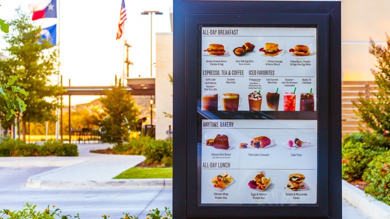
I was recently reminded of this when at a Starbucks. Their food menu was labeled: All-Day Breakfast, Anytime Bakery, and All-Day Lunch. I started thinking they probably started with Breakfast, Bakery, and Lunch as labels but customers kept assuming that breakfast was only available in the mornings. So that label got changed to "All-Day Breakfast". But if breakfast is all-day, when can I get bakery items? And the label changed to "Anytime Bakery". At first blush these labels might seem excessively wordy but they're probably intentionally more obvious. And probably more obvious than originally thought necessary.
For even more on making product value obvious, check out my full Mind the Gap presentation.
