Over twenty years ago (ouch), I outlined how and why visual hierarchy should be used to make the purpose and function of user interfaces clear. Since then, I'm pretty sure most of the feedback I've given on UI design has included visual hierarchy questions. Why?
Each and every screen in a Web site or app needs to make its purpose clear to a user: what can they do and how can they do it? Without visual hierarchy, this becomes very difficult. Image a screen where every bit of content and every action looks the same. It would be impossible to tell the difference between things and thereby very difficult to use.
Of course, the situation is more subtle in most UI designs. Designers make buttons look like buttons and headlines look like headlines. But the overall balance between all these elements often lacks intention. That is, the visual hierarchy doesn't reflect the purpose and function as emphatically as it should.
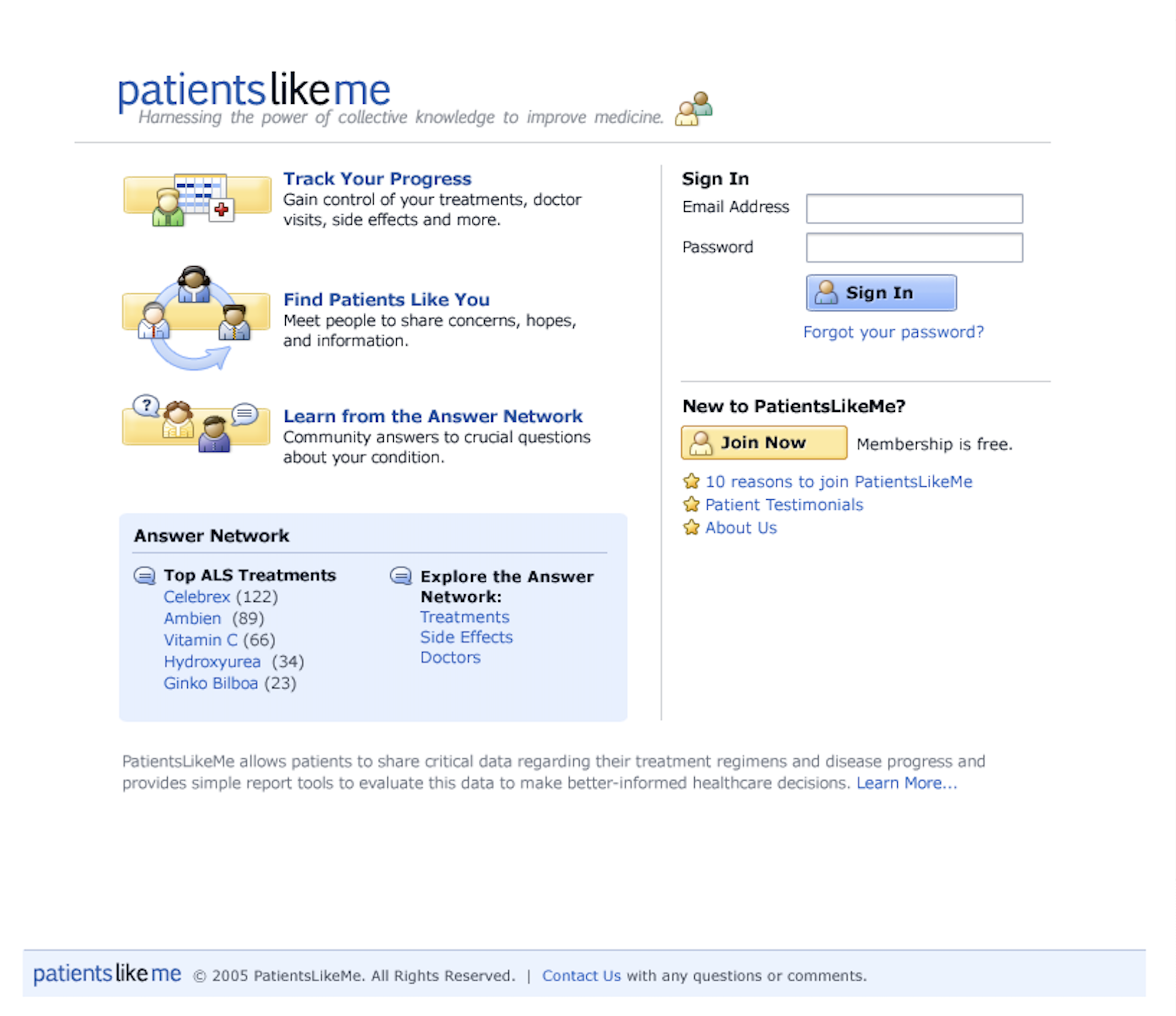
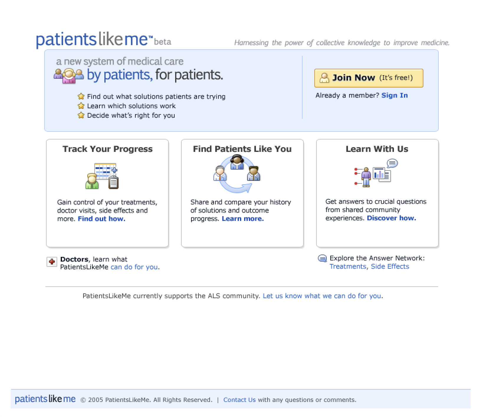
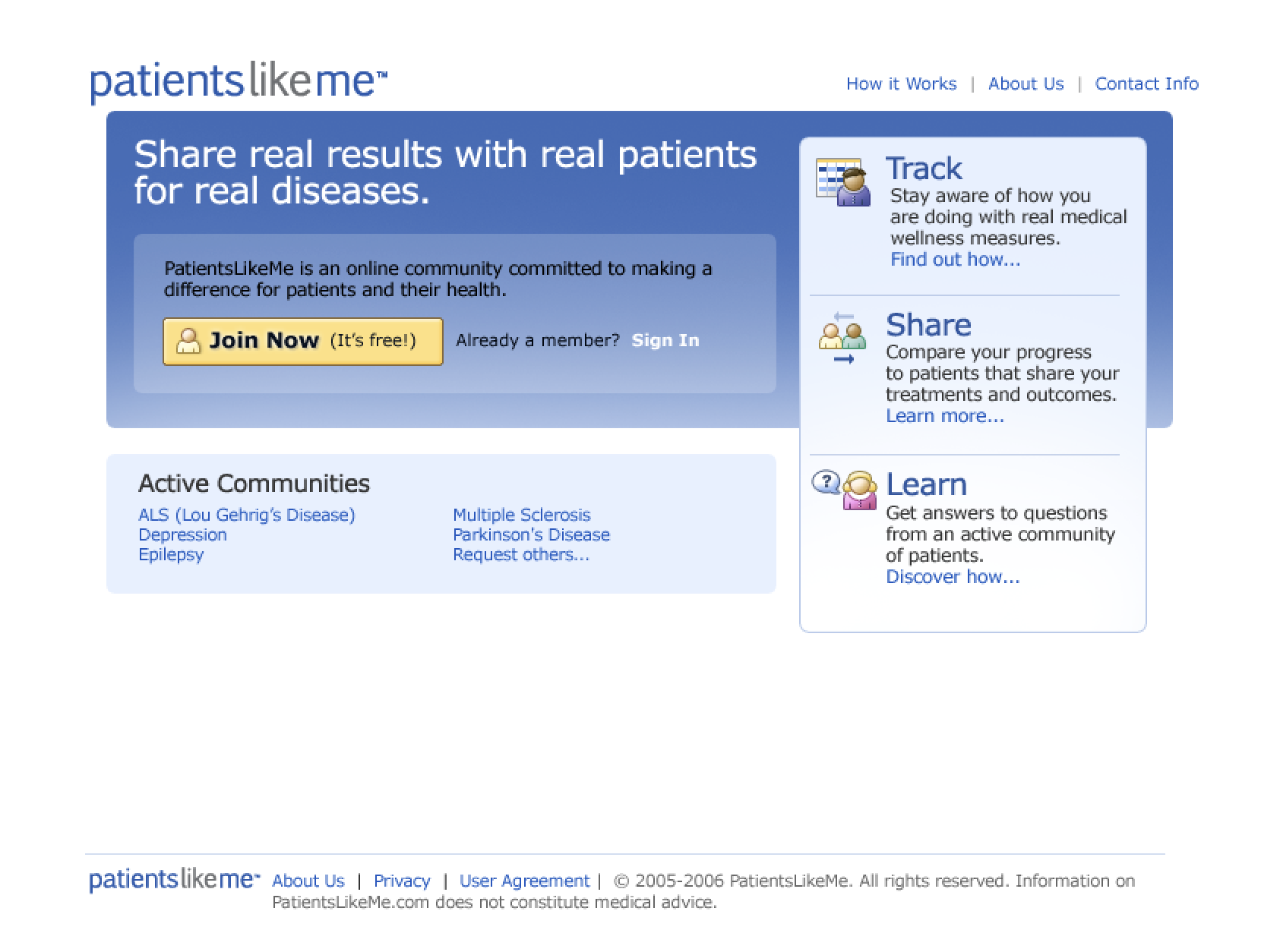
To illustrate with an example, here's a sequence of design iterations for the PatientsLikeMe home page from 2006. Yes, I'm dating myself again but this design aesthetic probably requires some caveating.
The iteration above doesn't have enough visual hierarchy. Everything is at a similar level of visual weight so it all kind of blends together. This happens because our eyes end up bouncing between all the visually equal elements. They aren't being intentionally guided through a narrative, a prioritization, or a hierarchy.
In the revision above, things are more visually organized. We're using visual elements like background colors, repeating shapes and fonts styles to outline the major sections of the page. This allows our eyes to take in the higher level sections first, then dig into details when they're relevant.
Here we've added even more visual contrast between the elements on the page. This once again helps guide our eyes. We're using the visual priority of the page elements to help walk people through what this site is for and how they can get started using it.
So how can you tell when there's the right amount of visual hierarchy in a UI design? Just squint. This will blur the design just enough to quickly identify if the important elements stand out. I call this the squint test.
But which elements are the important ones? I love this question because it turns visual hierarchy discussions into strategic ones. To know the answer, you need to understand what product you are making, for whom, and why. With this knowledge, what's important is clear and a good product design is just a mater of reflecting it through visual hierarchy.


