Many implementations of rich Web interaction designs encounter issues of discoverability. As I pointed out in Bringing Desktop Interactions Online, the awareness of actions like drag and drop and multi-select within Web applications is often low because people don’t expect these behaviors to be possible. As a result, designers often include messaging to educate users on what’s possible.
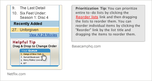
Persistent messaging can be seen in these examples from Netflix & Basecamp (below).

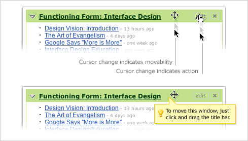
Another common approach to addressing discoverability is “just in time messaging”. These messages reveal themselves only when a user performs an action that indicates they may be looking for specific functionality. A subtle but quite effective form of just in time messaging is a simple cursor change as shown in the example from My Yahoo! below. A stronger form of just in time messaging could be bubble help that lets users know what’s possible. Overuse of bubble help, however, can frustrate more than inform. Once someone learns the behavior (i.e. successfully drags and drops a window), the need for bubble help may be gone.

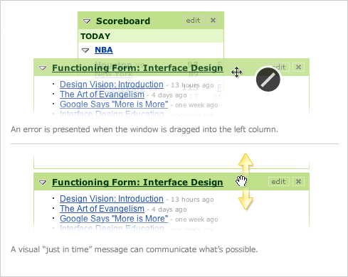
Visual just in time messages can also be useful for communicating what’s possible. These messages are often more explicit than cursor changes and utilize more screen real estate for communication.
In the My Yahoo! example, windows in the left column can only be dragged vertically. When a user attempts to position one of these windows within a different column, an error message is presented. A visual just in time message can reduce the frequency of this error state by clearly communicating what actions are possible –in this case with arrows.

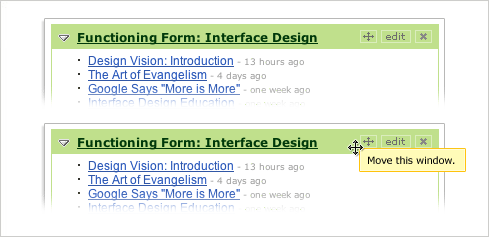
Discoverability can also be addressed with appropriately placed indicators of functionality. In the example below, “move” is included alongside the “edit” and “close” actions making the ability to reposition the window a bit more explicit. These indicators, of course, can also be used together with just in time messaging.
