It’s tempting to rely on menu controls in order to simplify mobile interface designs —especially on small screens. But hiding critical parts of an application behind these kinds of menus could negatively impact usage.
Out of Sight, Out of Mind
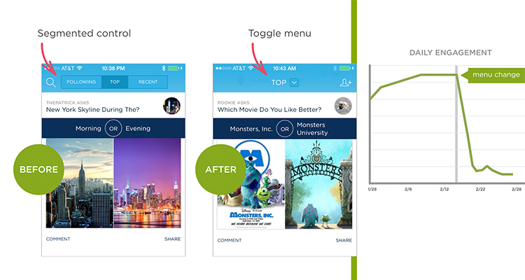
In an effort to simplify the visual design of the Polar app, we moved from a segmented control menu to a toggle menu. While the toggle menu looked “cleaner”, engagement plummeted following the change. The root cause? People were no longer moving between the major sections of the app as they were now hidden behind the toggle menu.
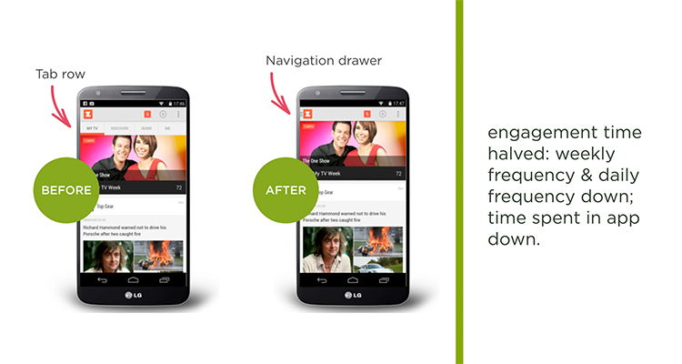
A similar fate befell the Zeebox app when they transitioned from a tab row for navigating between the major sections of their application to a navigation drawer menu. Critical parts of the app were now out of sight and thereby out of mind. As a result, engagement fell drastically.
In Sight, In Mind
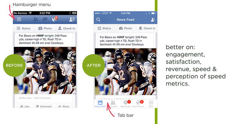
When critical parts of an application are made more visible, usage of them can increase. Facebook found that not only did engagement go up when they moved from a “hamburger” menu to a bottom tab bar in their iOS app, but several other important metrics went up as well.
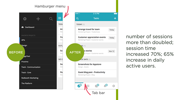
Similarly, Redbooth’s move from a hamburger menu to a bottom tab bar resulted in increased sessions and users. Previously out of sight functionality was now front and center.
What’s Important Enough to Be Visible?
Because there’s not a lot of space on mobile screens, not everything can be visible in a mobile UI. This makes mobile design challenging. Unlike the desktop where big screens allow us to squeeze in every feature and function on screen, mobile requires us to make decisions: what’s important enough to be visible on mobile?
Answering that question requires an understanding of what matters to your users and business. In other words, it requires good design.


