The word mobile has come to mean many things. But when designing mobile software, we need some clarity. What kind of devices are we talking about and how do people interact with them?
Looking at ScientiaMobile’s report on 5.2 billion Web requests from the end of 2014 gives some answers. Globally, smartphone penetration is close to or over 60% on all continents. Feature phones, where still used (Africa 7% , South America 8%), are continuing to decline.

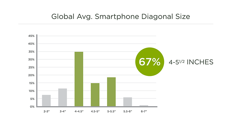
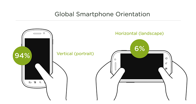
67% of smartphones range between 4 and 5.5 inches and 94% of the time they’re used in portrait orientation. Note this data is based on Web browsing but native app numbers are unlikely to change the majority of use to landscape.
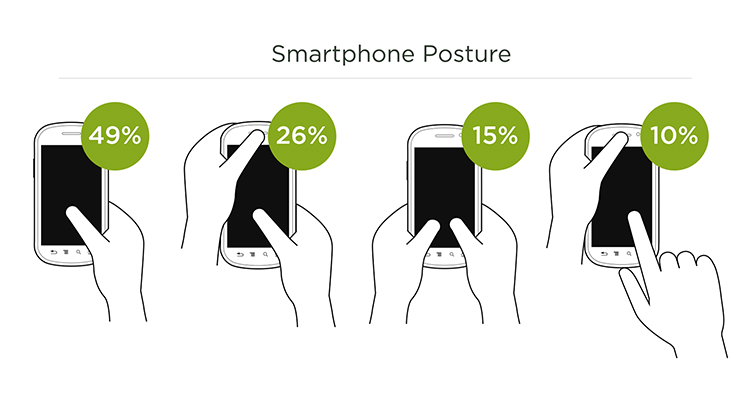
When in landscape mode, most interactions (72%) rely on just one thumb as Steven Hoober's 1,300+ observations of smartphones in use illustrated.
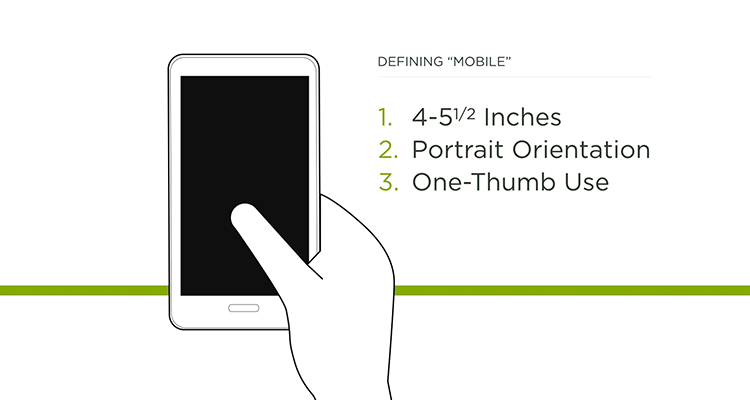
So when designing for mobile today, it’s worth considering a 4-5.5 inch smartphone, in portrait (vertical) orientation, being used with one-thumb. Of course, there many variants as well but making sure your mobile experiences work well in this context is a great baseline to start from.
A few examples of how this baseline can inform design decisions and testing:

