It used to be the biggest problem Log In pages faced were forgotten passwords and accounts. People would regularly forget the password or email address they used to sign up or mistakenly believe they either had an existing account or didn't have one.
Just how bad was it? User Interface Engineering's analysis of a major online retailer found that 45% of all customers had multiple registrations in the system, 160,000 people requested passwords per day, and 75% of these people never completed the purchase they started once they requested their password. Ouch.
Third Party Sign In
"Single-sign on" solutions like Open ID, Facebook, Twitter, and more have tried to fix some of these issues by cutting down on the number of Sign In details people need to remember across the Web. With these services, one account (usually consisting of email and password) can get you into many different Web sites.

Signing In is faster too. When someone connects their Facebook or Twitter account to a Web site, they simply need to click the Sign In with Facebook or Twitter button to log in. Of course, they need to be signed in with the account provider to have things work with one click. But since 50% of Facebook's 500 million active users log on to Facebook in any given day —odds are good one click is all it will take.
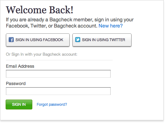
So the Sign In screen on Bagcheck put one click login actions front and center to make signing in easier. It also allowed people to sign in using their email address and password if they preferred to (below).
New Log In Problems
But with these new benefits come new problems as well. Most notably, people forget which account provider they used to sign up for a site, which makes them unsure about how to proceed. In the words of one of our friends on Bagcheck:
"Whenever I have to sign into Bagcheck, I'm filled with anxiety. Not because I don't love the service, but because of the log in screen. I cannot remember whether I signed up through Facebook, Twitter or if I should know some special entry credentials."That's kind of the opposite of not making people think. Worse still, if someone picks the wrong provider instead of signing in they might end up signing up again and thereby creating a new account.
So while third party Sign In helps address some problems it also creates new ones. In an attempt to solve some of these new Sign In issues, we've been experimenting with a few new Log In screen designs on Bagcheck.
Forgot How You Signed Up?
Our first design approach tried to keep things quick and easy for people who knew exactly how they signed up and also gave people who were unsure a way out. To do so, we presented a set of one-click Sign In buttons at the top of the Sign In screen and an input field that said "Forgot how you signed up? Enter your name."
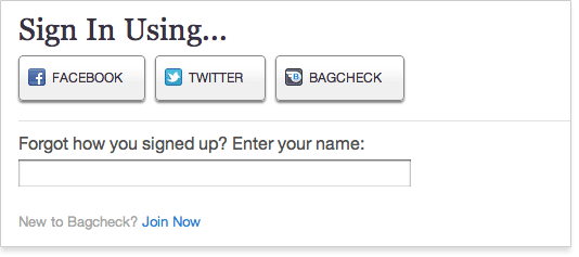
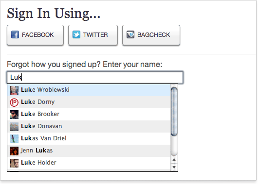
When someone started typing their name, instant search results would show up highlighting Bagcheck members that matched what they typed.
Once you selected your name from the list, the page would hide any Sign In options that wouldn't work for your account leaving only the options that would. So if you could not sign in using Twitter, that Sign In button would disappear. We also included a little snippet of text that explicitly told you how you could Sign In. This was done to cover the case where someone could sign in using any provider since no options would be removed.
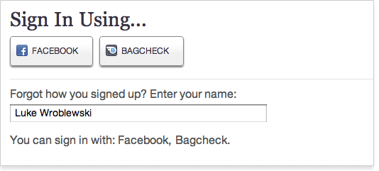
While we liked the ability for people to recall how they signed up using the "Forgot?" text input, the rest of this design had some problems. It was strange how options above the text field would disappear and the fact we needed clarifying text to explain things told us the design was not there yet. Worst of all, we were still seeing people try to Sign In with accounts they had not yet connected to Bagcheck.
First Enter Your Name
Our latest Sign In screen design is a bit more aggressive at preventing errors (at the expense of one-click sign in). In this design, people are required to enter their name (or email address) in order to sign in. Once again, we use instant search results to match them to an existing user. This time, however, the options they have for signing in are not revealed until they select their name or enter their email address.
We allow people to find themselves using their email address as a way to cover multiple common names, and the off chance someone created an account with a variant of their name.
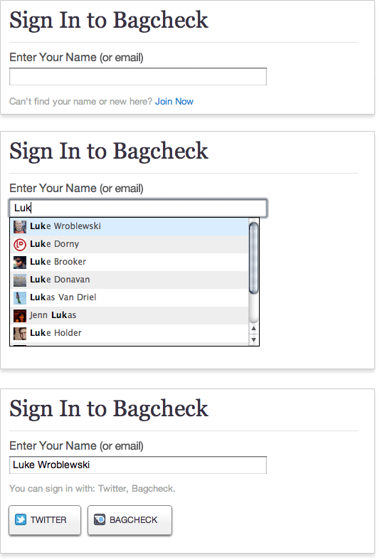
In this design, people can no longer sign in with one click. But this may be a worthwhile trade-off because:
- We keep people signed in until they explicitly sign out. So hopefully people rarely need to go through the sign in process.
- The amount of effort added to sign in is small —just start to type your name (or enter your complete email address), select a search result, then click a Sign In button. It's not one click but it's not a lot of work either.
- It's no longer possible to try signing in with an account provider you have not set on Bagcheck because the login buttons don't show up until after you select your name.
Design is Never Done
Though we've made some progress in tackling these new Log In issues, design is never done. Did we go too far toward error prevention? Is single-click sign in important enough to justify the occasional mistake? Are there other design options we should consider? We're happy to keep iterating so thanks for any ideas you have.
UPDATE: Marty Moore created another design solution that also allows people to connect a new account or sign up using the same Log In screen.