During part of our conversation on the Big Web Show yesterday, Jeffrey Zeldman, Dan Benjamin, and I discussed some of the ways designing for mobile first can help mitigate some of the thorny issues that have plagued designers for years.
And the Kitchen Sink...
One of the longest standing issues in Web design has been the "everything including the kitchen sink problem". This problem exists because adding things to a Web site is relatively easy. So lots of things get added -especially when multiple stakeholders are involved. Different internal departments, feature owners, businesses, and individuals have different requirements for Web sites. So designers are often left trying to balance many promotions, interactions, content modules, navigation options, and more in a single layout. On a 1024x768 screen there's lots of pixels to fill!
When you design for mobile first, a set of inherent constraints keeps you in check. Perhaps the most impactful of these constraints is screen space. When you are working with a 320x480 pixel screen (iPhone, Palm Pre, first generation Android phones), 80% of the screen space you had at 1024x768 is gone. That means 80% of the content, navigation, promotions, and interactions needs to go. And that's... great.
Losing 80% of your screen space forces you to focus. You need to make sure that what stays on the screen is the most important set of features for your customers and your business. There simply isn't room for any interface debris or content of questionable value. You need to know what matters most. In order to do that you need to really know your customers and your business. Which is good design 101. Designing for mobile forces you to get there -like it or not.
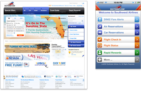
Consider the difference between the Southwest Airlines Web site and iPhone app. Lots of pixels available on the Web site so they've been filled with lots of irrelevant cruft. Because they can be. The mobile app, on the other hand, has a laser-like focus on what customers need and what Southwest does: book travel, check in, check flight status, check miles, etc. No room for anything else. Only what matters most.

If you design mobile first, you create agreement on what matters most. You can then apply the same rationale to the desktop/laptop version of the Web site. We agreed that this was the most important set of features and content for our customers and business -why should that change with more screen space? (Note: There are of course, some differences based on the mobile and desktop contexts but the core value and service of a Web site remains the same.)
The Same in Every Browser
For years, Web designers and developers have struggled to make Web sites look and act the same in every browser. But every browser is different. They each have their own capabilities and limitations. So making every experience the same across all browsers means not taking advantage of some opportunities (capabilities) and hacking around existing limitations. Not great.
The onset of many networked consumer devices with different capabilities and limitations has begun to open a lot of people's eyes to the fact that Web sites don't have to look and act the same in every browser. In fact, they shouldn't. Designing for mobile first establishes that up front. How you present your key actions and information on mobile is likely to be different than the desktop. And that's ok.
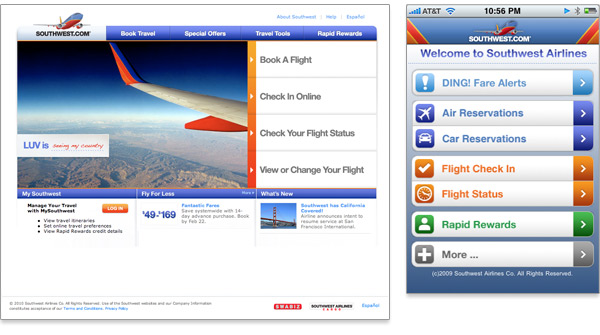
Let's compare a different design of the Southwest Airlines Web site with the mobile version again. This time, both designs are focused on what matters most to customers and the business. But the designs are not the same, they are appropriate for the form factor of the device.

So do Web sites have to look the same in every browser? No. Designing mobile first makes that pretty clear.
Making the Case for Mobile First
So if designing for mobile first helps designers manage these thorny issues, how do you get clients and stakeholders to sign up for starting with mobile? Simply pull out the stats.
- Heavy mobile data users are projected to triple to one billion by 2013. (source)
- Mobile internet adoption has outpaced desktop internet adoption by eight times. (source)
- Smartphone sales will surpass worldwide PC sales by the end of 2011 . (source)
- And more...