Apple's iPad User Experience Guidelines recommend that applications designed for the iPad have a realistic, physical dimension.
"The more true to life your application looks and behaves, the easier it is for people to understand how it works and the more they enjoy using it." -Human Interface Guidelines for the iPad
In the best case, this guideline helps developers create Natural User Interfaces (NUIs) that are able to "exploit skills we have acquired through a lifetime of living in our World" (per Bill Buxton's definition). In the worst case, it leads to overly contrived "real-world" metaphors as the basis for user interactions that artificially limit what digital systems can enable people to do.
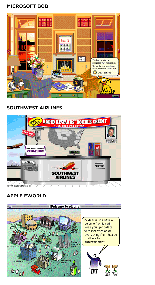
Product's like Microsoft's BOB operating system, Southwest Airlines' original Web site, and even Apple's eWorld made poor use of "realism" by forcing people to learn from scratch. No one knew what was located in BOB's house nor where anything was in BOB's house because they had never been there. Nobody knew their way around Southwest's ticket counter because they had only encountered one if they bought a Southwest ticket at the airport. Same with eWorld -it was "realism" without the reality. In these circumstances, it's hard to exploit people's existing skills because they have none.

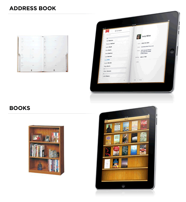
In contrast, Apple's early iPad apps use objects many people are familiar with as the basis for their user interface: bookshelves for accessing and storing books; address books for accessing and storing contact information; and more. These application designs take advantage of skills people actually have acquired through years of interactions with the real world and highlight how physicality and heightened realism may lead (the jury is still out) to more usable designs.

Apple's Physicality and Heightened Realism guideline may also be a deliberate recognition of (or push for) the digitalization of many of our common physical objects. More on that topic...