As the gap between desktop and Web applications continues to close, interaction designs previously reserved for the OS are making their way online. Unfortunately, the transition is not always a smooth one.
Interactions that reveal themselves in context are likely to have the easiest time making the move from desktop to Web. For example, auto completion of user input doesn’t require different upfront behavior on the part of users. Simply start typing in a text field as you always do and suggestions reveal themselves below. Based on the presentation of these suggestions (within a vertical list of options), you are likely to assume you can select one with your mouse or arrow keys and (when the component is designed right) you can.
Other forms of desktop interaction don’t have the luxury of being visible when they are needed. In fact, actions like double-click, right-click, and drag & drop are not visible at all. You need to know that these options exist in order to make use of them. This problem is magnified in the single-click world of the Web browser where few people imagine that single-click selection, double-click launching, right-click menu access, or drag and drop are possible. To address this issue, designers often opt for direct communication by including messages that describe drag and drop behaviors and making actions explicit through links or images.
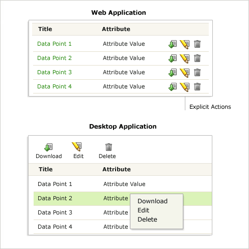
In the example above, the Web version of a simple data table includes explicit actions within each row to Download, Edit, or Delete a file. The desktop version relies on single-click selection or right click menus to accomplish the same actions.
Without selection, reordering the table above or applying actions to multiple entries within it is cumbersome. Without right-click access to multiple actions, the table can quickly fill up with too many icons or links per row. So there’s something to be gained by bringing desktop interactions to the world of Web applications. The question, of course, is how.
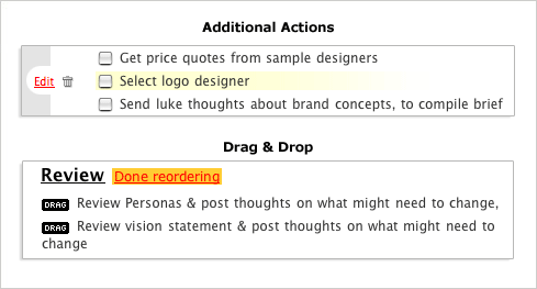
37signals’ BaseCamp uses a quick mouse hover to reveal actions usually found with a right-click in desktop apps. They also make drag and drop behavior explicit by having users change modes to reorder a list (explained by messaging on the page).
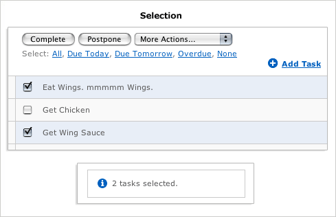
Remember The Milk tries to enable selection with multiple indicators: color change (selected rows are blue), checkbox (selected rows are checked), and messaging (you have 2 items selected). This over communication seems to indicate that users don’t catch on to the interaction.
In both examples, messaging is still required to communicate the interaction design, but good steps are taken toward the right approach: reveal interaction options when they are needed with just enough indication to explain their behavior.