Using software can be hard. All those form fields, menu items, interactive widgets and more... continually changing. So why make it harder for people by strewing all these user interface elements around a screen? This happens enough in applications that it needs a name. So let's call it Pinball UI.
Pinball UI happens when the various user interface elements on an application screen could be arranged meaningfully... but are not. An intentional layout of user interface elements can help people make their way through a process (like filling in a form) or make the relationships between various bits of content and actions clear. Designers use visual relationships to make these functional relationships clear to users. In Pinball UI, they do not.
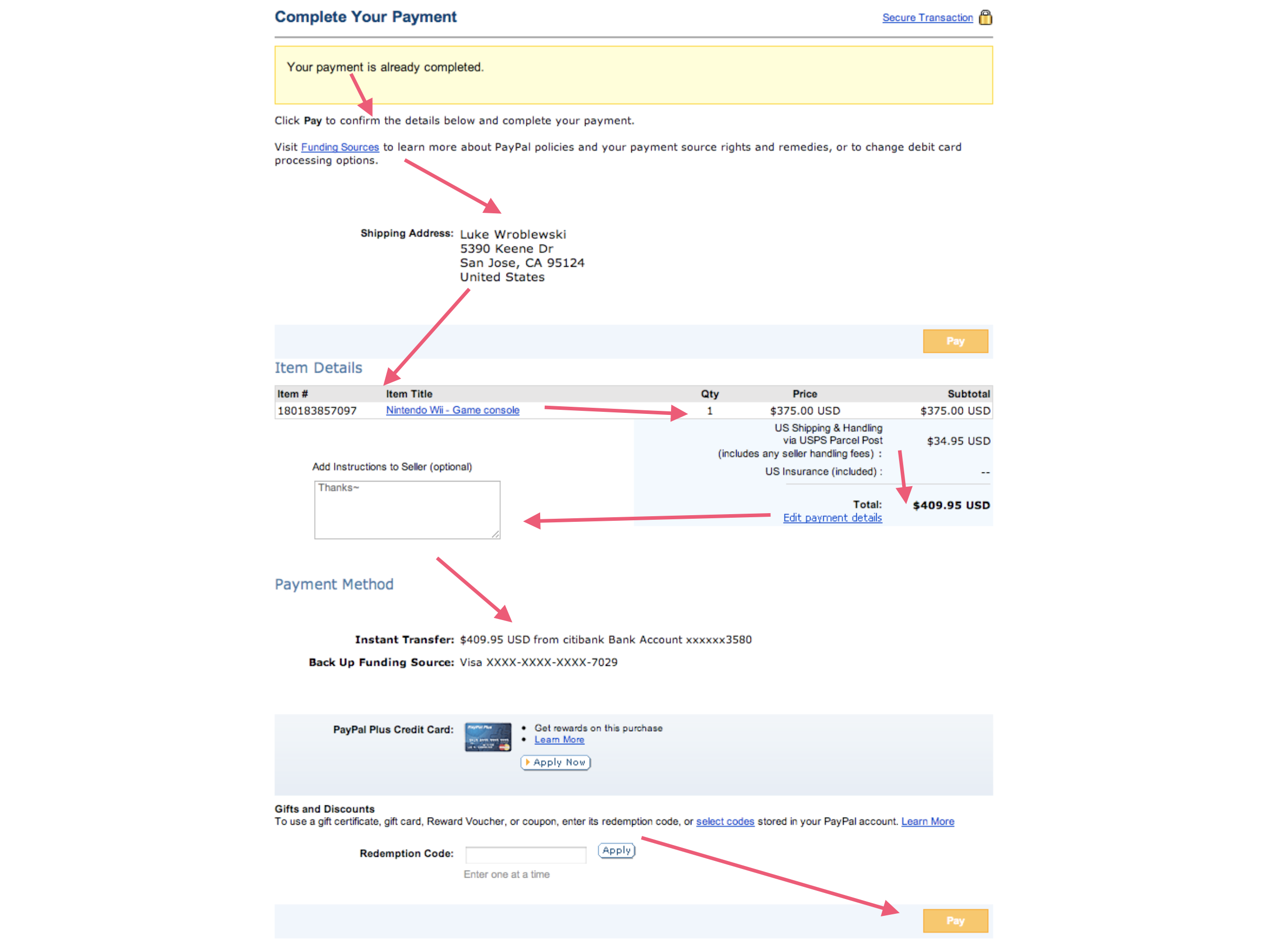
Let's illustrate with an example. The "Complete Your Payment" form on PayPal is a pretty critical screen. You've found something you want to buy and are ready to pay. But instead of doing so quickly and effectively... you're playing pinball. The various user interface elements required to complete the payment process are tossed about the screen and people have to go hunting for what's next.
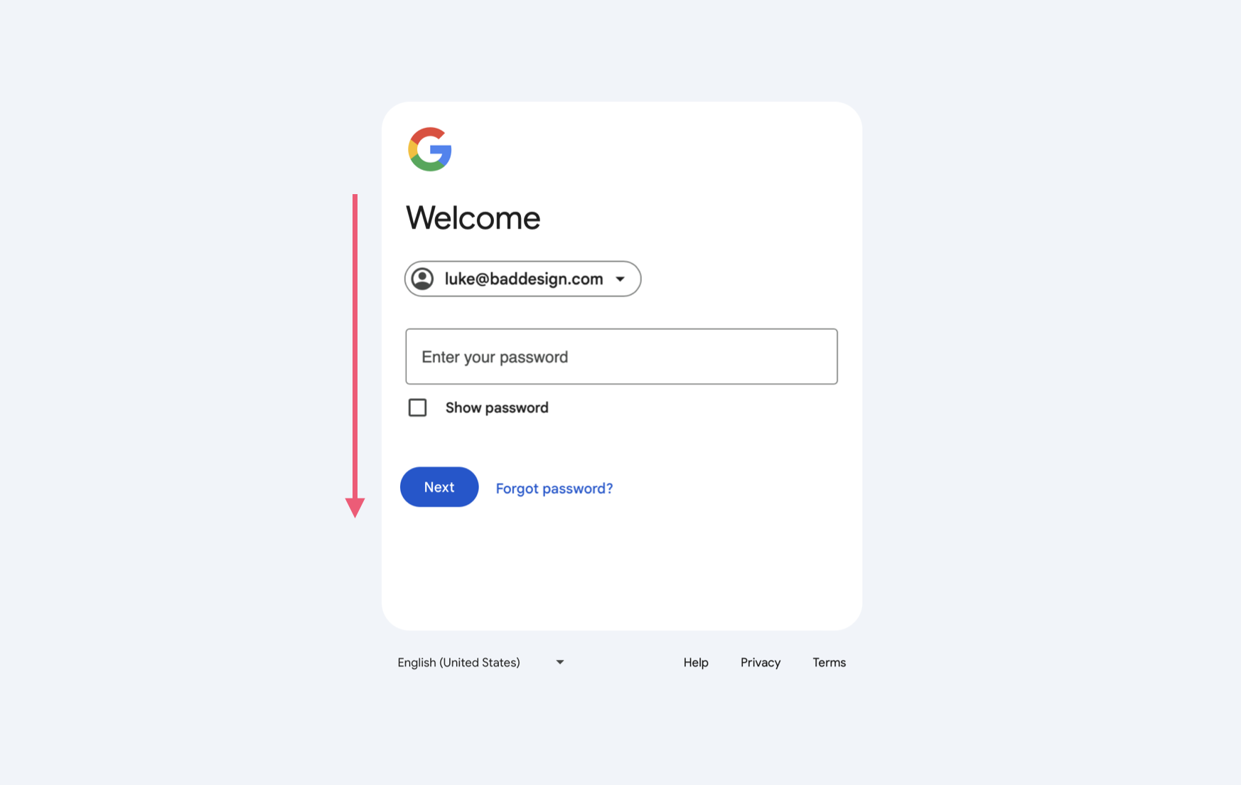
In this proposed redesign of the PayPal form, the steps required to complete a payment flow a clear path to completion. The headers, form elements, content, and primary action are all clearly aligned in a simple sequence. No darting around the screen to figure out what's next or how things are related.
This example from PayPal was featured in my 2008 book, Web Form Design, alongside user research and eye-tracking data highlighting why clear paths to completion reduce errors, speed up annoying processes (like filling in Web forms), and give people more confidence in their actions. So now it's 2024 and Pinball UI is a thing of the past, right?
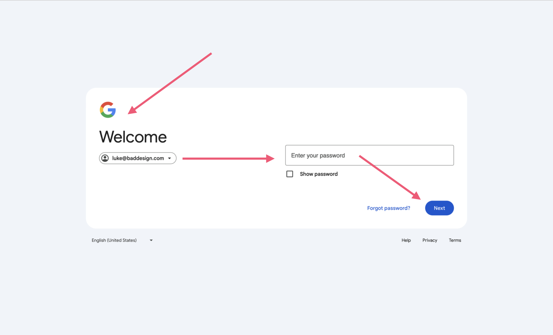
Looking at Google's new Sign Up form, maybe not. Although there's a lot less UI on Google's form than on PayPal's payment form, the Pinball UI is still there. Our eyes bounce around the screen to make progress. With just a few UI elements on the screen, this could be easily fixed:
Maybe there's other constraints driving Google's layout decisions that aren't apparent to those of us looking at it from the outside.. or maybe they just like pinball.